Day15 今天我想來點...純 CSS 的並排選單
 899
899
 4 min
4 min
 2023-09-29

昨天我們做了一個開關,那麼我們今天就來做一個選單吧!
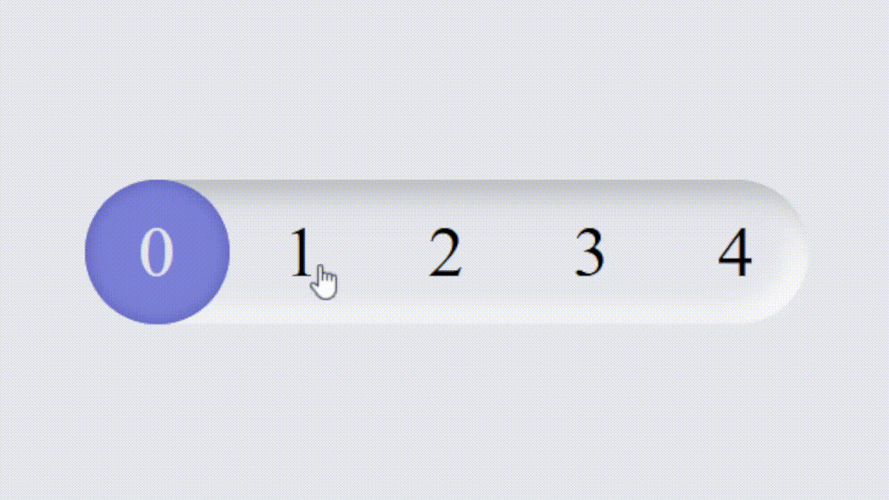
這個雖然是一種 radio 選單,但對於選擇數字這種有連續性,或著是比較短的文字,使用這種風格都是一種不錯的選擇。可以讓版面更乾淨,也比下拉式選單或著是傳統的 radio 都更方便操作。重點是不用寫一行 JavaScript,只要純 CSS 就可以完成。
原理
和昨天的類似,不過今天不需要 <label>。點擊透明的 <input> 之後後面的一個圓形 <div> 就會跑過來。最上面用一層 <div> 疊上去數字即可,當然你要使用 <label> 也是可以的。
開始做吧!
照剛才原理寫出 HTML,然後加上 CSS 即可。
HTML
<div class="hope-container">
	<input type="radio" name="hope" value="0" />
	<input type="radio" name="hope" value="1" />
	<input type="radio" name="hope" value="2" checked="" />
	<input type="radio" name="hope" value="3" />
	<input type="radio" name="hope" value="4" />
	<div class="hope-selected"></div>
	<div class="hope-label">
		<div>0</div>
		<div>1</div>
		<div>2</div>
		<div>3</div>
		<div>4</div>
	</div>
</div>新擬物化設計 Neumorphism 的介面
CSS 的部分我想要製作使用新擬物化設計 Neumorphism,或是說 Soft UI 的風格。有點像 iPhone3 擬物化設計跟 iPhone5 之後現代扁平化設計結合。有很明顯得陰影但又很有質感。

基本外框如下
* {
	padding: 0;
	margin: 0;
	transition: all 0.2s;
}
body {
	display: flex;
	justify-content: center;
	align-items: center;
	min-height: 100svh;
	background: #e6e7ee;
}
.hope-container {
	height: 2rem;
	border-radius: 2rem;
	position: relative;
	display: flex;
	box-shadow:
		3px 3px 6px #b8b9be inset,
		-3px -3px 6px #fff inset;
	background-color: #e6e7ee;
}選擇框
這是裡面看不到的輸入框
.hope-container input {
	width: 2rem;
	height: 2rem;
	display: block;
	opacity: 0;
	cursor: pointer;
}顯示數字
上面疊數字。為了讓數字對齊每個都寬度設為 2rem 再置中。
.hope-label {
	position: absolute;
	left: 0;
	pointer-events: none;
	display: flex;
	align-items: center;
	justify-content: space-between;
	width: 100%;
	height: 2rem;
}

.hope-label > div {
	width: 2rem;
	text-align: center;
}小球
最後是選擇,並會左右移動的圓形。設定 position: absolute 並用 left 屬性來移動他的位置。這樣就可以做到左右移動的效果。
.hope-selected {
	width: 2rem;
	height: 2rem;
	position: absolute;
	left: 0;
	border-radius: 50px;
	background: #7a85dc;
	pointer-events: none;
	box-shadow: 0 0 3px #545fb6 inset;
}移動小球
根據選擇的值來移動小球。這邊使用 nth-child 來選擇第幾個元素。如果被勾選就會觸發 CSS 移動球到對應的位置。
.hope-container input:nth-child(2):checked ~ .hope-selected {
	left: 2rem;
}

.hope-container input:nth-child(3):checked ~ .hope-selected {
	left: 4rem;
}

.hope-container input:nth-child(4):checked ~ .hope-selected {
	left: 6rem;
}

.hope-container input:nth-child(5):checked ~ .hope-selected {
	left: 8rem;
}裡面的數字變色一下,不然紫色實在太暗了
.hope-container input:nth-child(1):checked ~ .hope-label > div:nth-child(1) {
	color: #e6e7ee;
}

.hope-container input:nth-child(2):checked ~ .hope-label > div:nth-child(2) {
	color: #e6e7ee;
}

.hope-container input:nth-child(3):checked ~ .hope-label > div:nth-child(3) {
	color: #e6e7ee;
}

.hope-container input:nth-child(4):checked ~ .hope-label > div:nth-child(4) {
	color: #e6e7ee;
}

.hope-container input:nth-child(5):checked ~ .hope-label > div:nth-child(5) {
	color: #e6e7ee;
}好啦,這樣就做完了!
https://codepen.io/elvismao/pen/LYMmQOE
以上就是我今天的分享,你可以根據你的喜好增加陰影或其他動畫效果。歡迎在 Instagram 和 Google 新聞追蹤毛哥EM資訊密技,也歡迎訂閱我新開的YouTube 頻道:網棧。
我是毛哥EM,讓我們明天再見。

毛哥EM


數位創作者,全端工程龍
