Day16 今天我想來...欸現在幾點?- CSS 畫出 iOS 時鐘
 1.6k
1.6k
 7 min
7 min
 2023-09-30

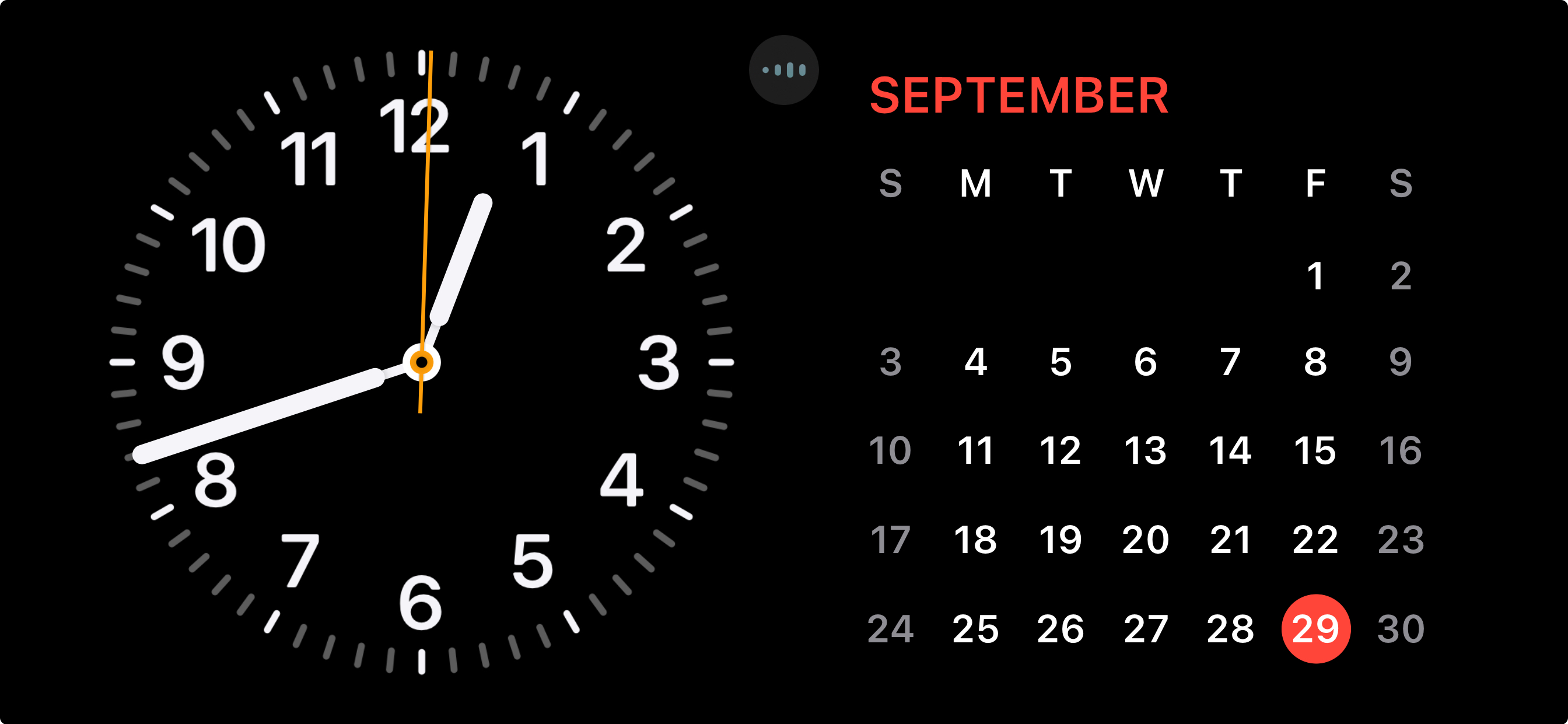
今天我們要來製作一個時鐘。不使用圖片,只使用 CSS 來繪製。我的目標是可以做出類似於 Apple iOS17 StandBy 的時鐘效果。
HTML
首先是 HTML,非常老實。一個時鐘,裡面 3 個指針,兩個中間的裝飾軸圓圈,以及 12 個數字。度數和數字分別用 CSS 變數和 HTML 屬性存放。當然你要都用 CSS 也可以,我只是想示範怎麼使用。
<div class="clock">
	<div class="hour-hand"></div>
	<div class="minute-hand"></div>
	<div class="second-hand"></div>
	<div class="clockCenter"></div>
	<div class="clockCenterCenter"></div>
	<div class="digit" style="--deg: 0;" data-digit="12"></div>
	<div class="digit" style="--deg: 30;" data-digit="1"></div>
	<div class="digit" style="--deg: 60;" data-digit="2"></div>
	<div class="digit" style="--deg: 90;" data-digit="3"></div>
	<div class="digit" style="--deg: 120;" data-digit="4"></div>
	<div class="digit" style="--deg: 150;" data-digit="5"></div>
	<div class="digit" style="--deg: 180;" data-digit="6"></div>
	<div class="digit" style="--deg: 210;" data-digit="7"></div>
	<div class="digit" style="--deg: 240;" data-digit="8"></div>
	<div class="digit" style="--deg: 270;" data-digit="9"></div>
	<div class="digit" style="--deg: 300;" data-digit="10"></div>
	<div class="digit" style="--deg: 330;" data-digit="11"></div>
</div>CSS
CSS 要怎麼畫出時鐘呢?我們會需要幫這個 div 添加幾個漸層。
時間刻度 - conic-gradient
為了方便大家比較我把圖放在一起。
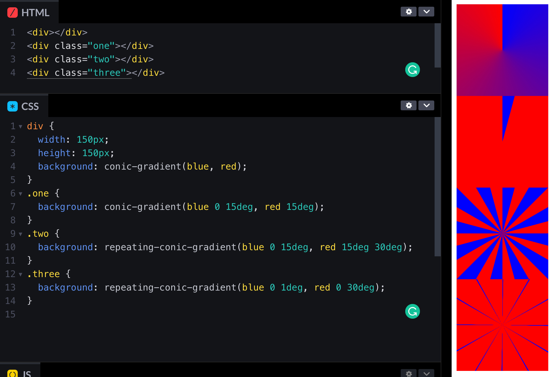
conic-gradient 的語法和其他漸層語法很相似。繞一圈跑,可以設定開始和結束的角度,沒寫角度就自動平分。比如說第一個:
div {
	width: 150px;
	height: 150px;
	background: conic-gradient(blue, red);
}如果你這樣打會得到一個錐形。和 linear-graient 的圖形原理相同,就是不給他過度的區域。
.one {
	background: conic-gradient(blue 0 15deg, red 15deg);
}設定開始結束角度就可以改成 repeating-conic-gradient 讓他重複。記得是 repeating 不是 repeat 喔~
.two {
	background: repeating-conic-gradient(blue 0 15deg, red 15deg 30deg);
}最後把角度條寫一點就可以囉~
.three {
	background: repeating-conic-gradient(blue 0 1deg, red 0 30deg);
}圓形 radial-gradient
radial-gradient 會從裡到外。一樣原理,不給他地方漸層就會出現圓形。讓他原形畢露
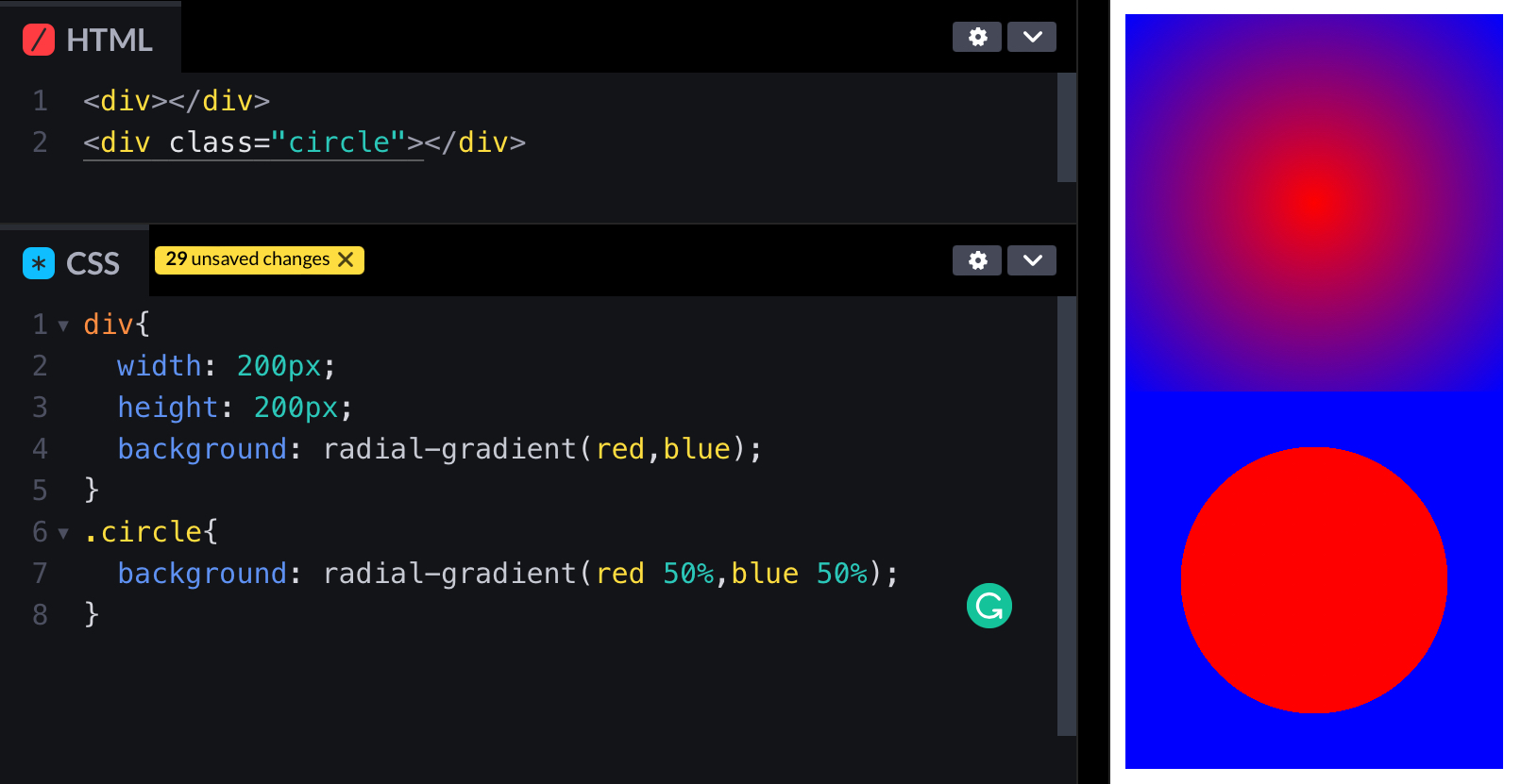
div {
	width: 200px;
	height: 200px;
	background: radial-gradient(red, blue);
}
.circle {
	background: radial-gradient(red 50%, blue 50%);
}這樣就可以把時鐘中間的部分挖出來囉。
旋轉時間
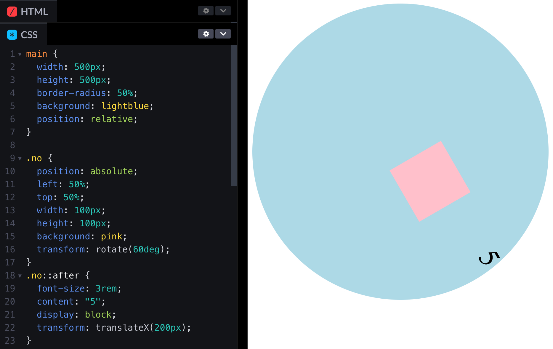
這個也蠻有趣的。首先在時鐘的中間放一個 div,用為元素在右邊放數字。
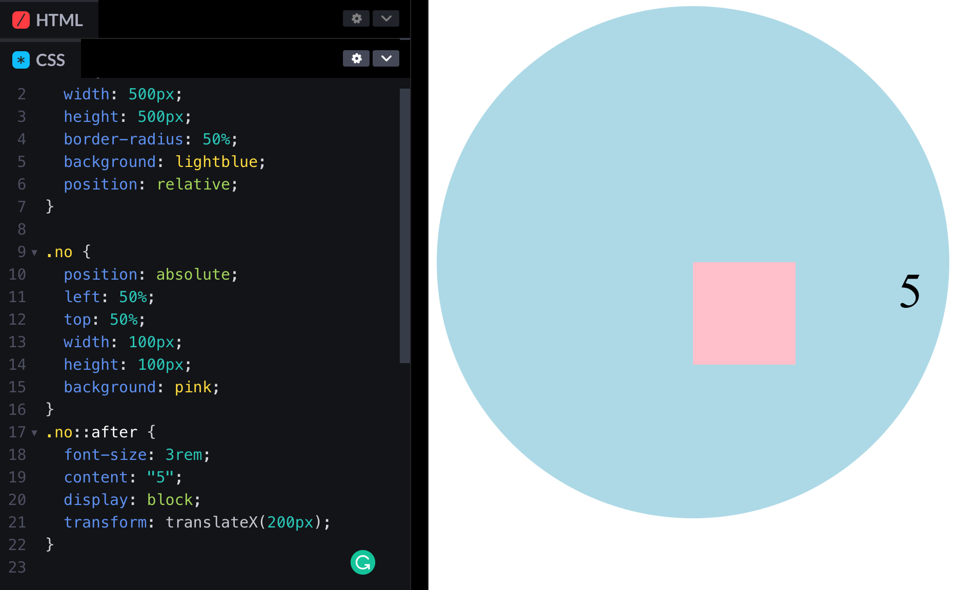
<main>
	<div class="“no”"></div>
</main>main {
width: 500px;
height: 500px;
border-radius: 50%;
background: lightblue;
position: relative;
}
.no {
position: absolute;
left: 50%;
top: 50%;
width: 100px;
height: 100px;
background: pink;
}
.no::after {
font-size: 3rem;
content: “5”;
display: block;
transform: translateX(200px);
}旋轉方塊裡面裡面數字也會跟著轉。
.no {
	position: absolute;
	left: 50%;
	top: 50%;
	width: 100px;
	height: 100px;
	background: pink;
	transform: rotate(60deg);
}不過這樣數字就歪了!沒事,偽元素轉回來就好了。
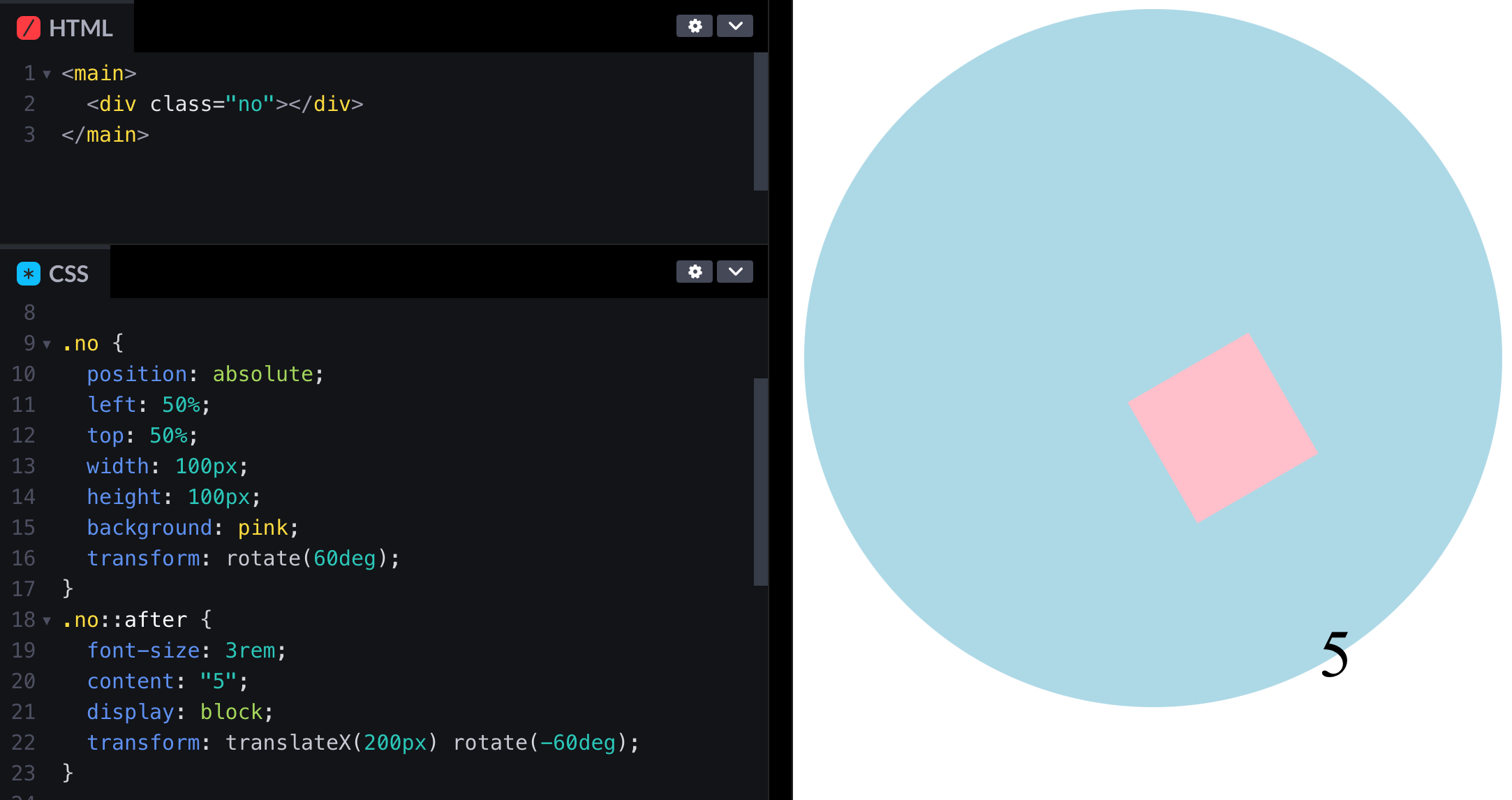
.no::after {
	font-size: 3rem;
	content: “5”;
	display: block;
	transform: translateX(200px) rotate(-60deg);
}你會發現因為我們剛才所有元素定位點都是靠上對齊所以有點偏移,沒關係最後再校正回歸就可以了。
指針
指針就跟剛才的粉紅正方形一樣,只是長一點而已。選轉定位點記得放在中間上面喔,這樣才能指對方向。
transform-origin: center center;在一起
把以上所以的和在一起吧。
body {
	display: flex;
	align-items: center;
	justify-content: center;
	min-height: 100svh;
	background: #000;
	font-family: system-ui;
	font-weight: 800;
}
.clock {
	width: 300px;
	height: 300px;
	background:
		radial-gradient(#000 65%, transparent 10%), repeating-conic-gradient(from -0.5deg, #fff 0 1deg, transparent 0deg 30deg), repeating-conic-gradient(from -0.5deg, gray 0 1deg, transparent 0deg 6deg);
	border-radius: 50%;
	position: relative;
}
.digit::before {
	content: attr(data-digit);
	display: block;
	transform: rotate(calc(var(--deg) * -1deg));
	text-align: center;
}
.digit {
	position: absolute;
	top: calc(50% - 15px);
	left: calc(50% - 16px);
	width: 1em;
	height: 1em;
	font-size: 2em;
	color: #fff;
	transform: rotate(calc(var(--deg) * 1deg)) translateY(-115px);
	transform-origin: center center;
}
.clockCenter,
.clockCenterCenter {
	position: absolute;
	top: 50%;
	left: 50%;
	transform: translate(-50%, -50%);
	width: 12px;
	height: 12px;
	background: #ffaf3f;
	border: 0.1em solid #fff;
	border-radius: 50%;
	display: block;
}
.clockCenterCenter {
	background: #000;
	border: none;
	width: 6px;
	height: 6px;
	z-index: 10;
}
.hour-hand,
.minute-hand,
.second-hand {
	position: absolute;
	top: 50%;
	left: 50%;
	background-color: #fff;
	transform-origin: top center;
}
.hour-hand,
.minute-hand {
	width: 10px;
	height: 70px;
	margin-left: -5px;
	border-radius: 5px;
}
.minute-hand {
	height: 128px;
}
.hour-hand::after,
.minute-hand::after {
	transform: translateY(-0.7em);
	display: block;
	content: "";
	width: 4px;
	margin-left: 33.333333%;
	height: 50px;
	background-color: #fff;
}
.second-hand {
	width: 2px;
	height: 168px;
	margin-left: -0.7px;
	background-color: #ffaf3f;
	border-radius: 2px 2px 0 0;
	transition: transform 0.2s;
}JavaScript
JavaScript 沒有什麼難的。就是小學數學題算時鐘走幾度。比如說秒針一分鐘走一圈,所以一秒走 360 除以 60 等於 6 度。
需要注意一下的是因為指針的定位點在中間上面,所以一開始是在 6 點鐘方向。你可以把指針改成從中間下面對齊,或著是度數直接加半圈。
const hourHand = document.querySelector(”.hour-hand“);
const minuteHand = document.querySelector(”.minute-hand“);
const secondHand = document.querySelector(”.second-hand“);
function updateClock() {
  const now = new Date();
  const hours = now.getHours();
  const minutes = now.getMinutes();
  const seconds = now.getSeconds();
  const hourRotation = ((hours % 12) * 360) / 12 + ((minutes / 60) * 360) / 12 + 180;
  const minuteRotation = ((minutes % 60) * 360) / 60 + ((seconds / 60) * 360) / 60 + 180;
  const secondRotation = ((seconds % 60) * 360) / 60 + 180;
  hourHand.style.transform = `rotate(${hourRotation}deg) translateY(18px)`;
  minuteHand.style.transform = `rotate(${minuteRotation}deg) translateY(20px)`;
  secondHand.style.transform = `rotate(${secondRotation}deg) translateY(-18px)`;
}

setInterval(updateClock, 1000);
updateClock();正當你以為終於結束的時候,你無意間看到了這個畫面…
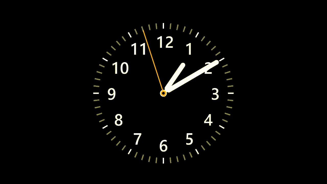
結果對了,方法錯了。因為角度降回 180,結果他還真的轉回去。

想要讓他一直轉下去就要提醒他莫忘初衷,把之前轉的度數都加進去即可。
const hourHand = document.querySelector(".hour-hand");
const minuteHand = document.querySelector(".minute-hand");
const secondHand = document.querySelector(".second-hand");
function updateClock() {
  const now = new Date();
  const hours = now.getHours();
  const minutes = now.getMinutes();
  const seconds = now.getSeconds();
  const hourRotation =
    ((hours % 12) * 360) / 12 + ((minutes / 60) * 360) / 12 + 180;
  const minuteRotation =
    ((minutes % 60) * 360) / 60 +
    ((seconds / 60) * 360) / 60 +
    180 +
    hours * 360;
  const secondRotation =
    ((seconds % 60) * 360) / 60 + 180 + (hours * 60 + minutes) * 360;
  hourHand.style.transform = `rotate(${hourRotation}deg) translateY(18px)`;
  minuteHand.style.transform = `rotate(${minuteRotation}deg) translateY(20px)`;
  secondHand.style.transform = `rotate(${secondRotation}deg) translateY(-18px)`;
}

setInterval(updateClock, 1000);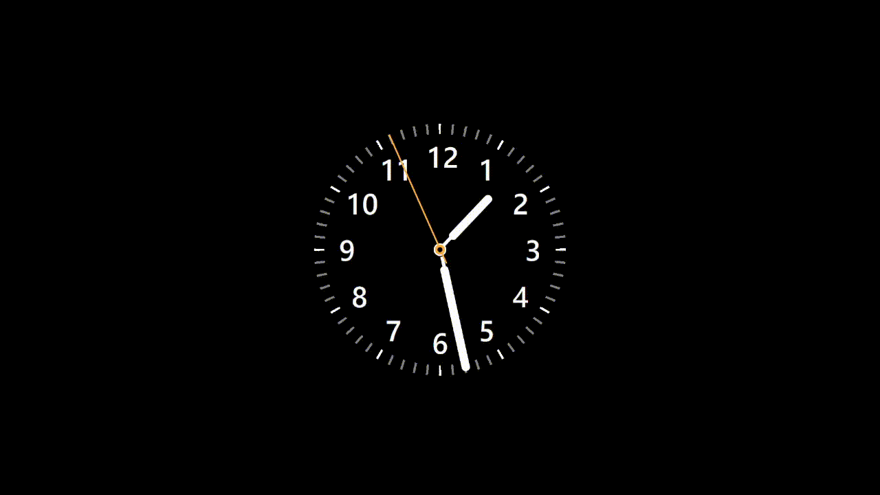
updateClock();終於成功啦!有個 87% 像吧 w
https://codepen.io/elvismao/pen/wvRXMLG
以上就是我今天的分享。我有看到有人是算了第一個角度之後就每秒固定加上去度數。不過萬一你有延遲或者是卡頓他的時間就會跑掉了,所以我還是建議每次都重新抓時間做計算。歡迎在 Instagram 和 Google 新聞追蹤毛哥EM資訊密技,也歡迎訂閱我新開的YouTube 頻道:網棧。
我是毛哥EM,讓我們明天再見。

毛哥EM


數位創作者,全端工程龍
