Day17 css.wav 純 CSS 波浪進度條
 703
703
 3 min
3 min
 2023-10-01

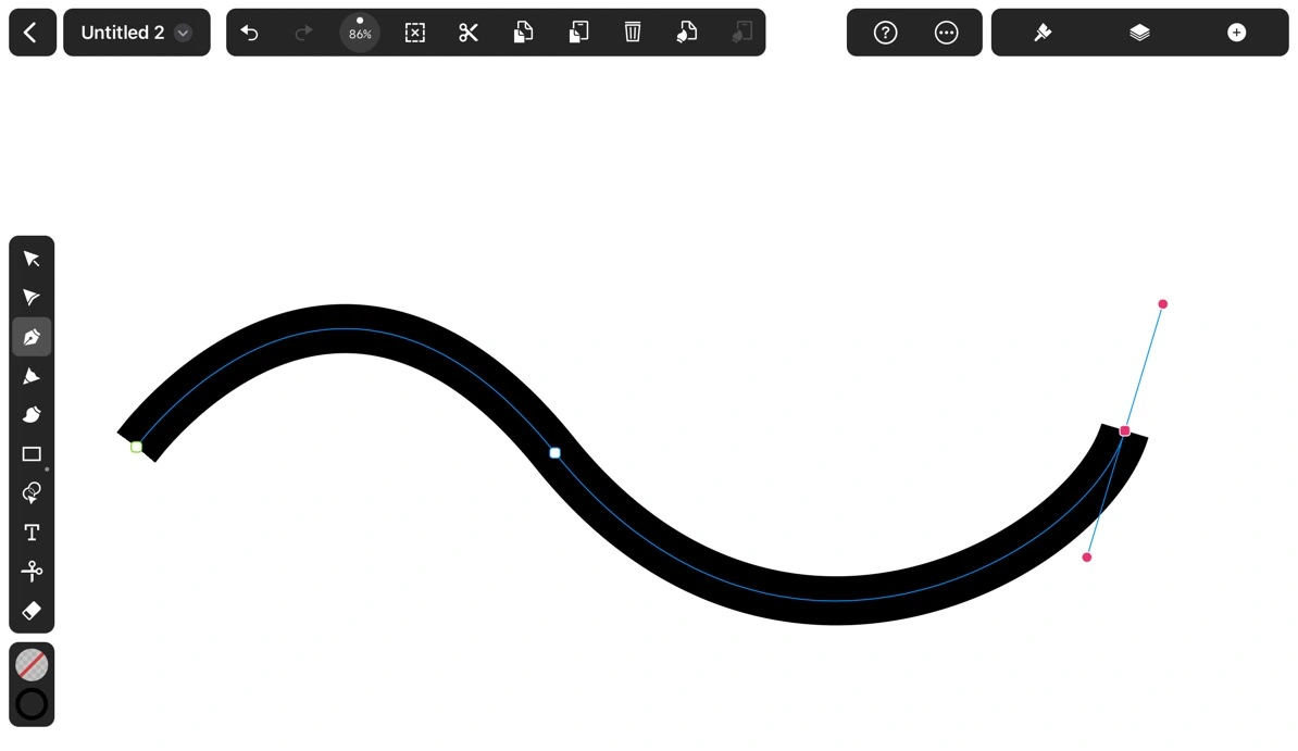
以往製作波浪效果不是使用 GIF 就是借助貝茲曲線。貝茲曲線就是 Ai 或是 Vectornator (現在叫做 Curve) 裡面的鋼筆工具。隨便拉都會有波浪的感覺,且使用 SVG 或 JavaScript Canvas 都不難實現。
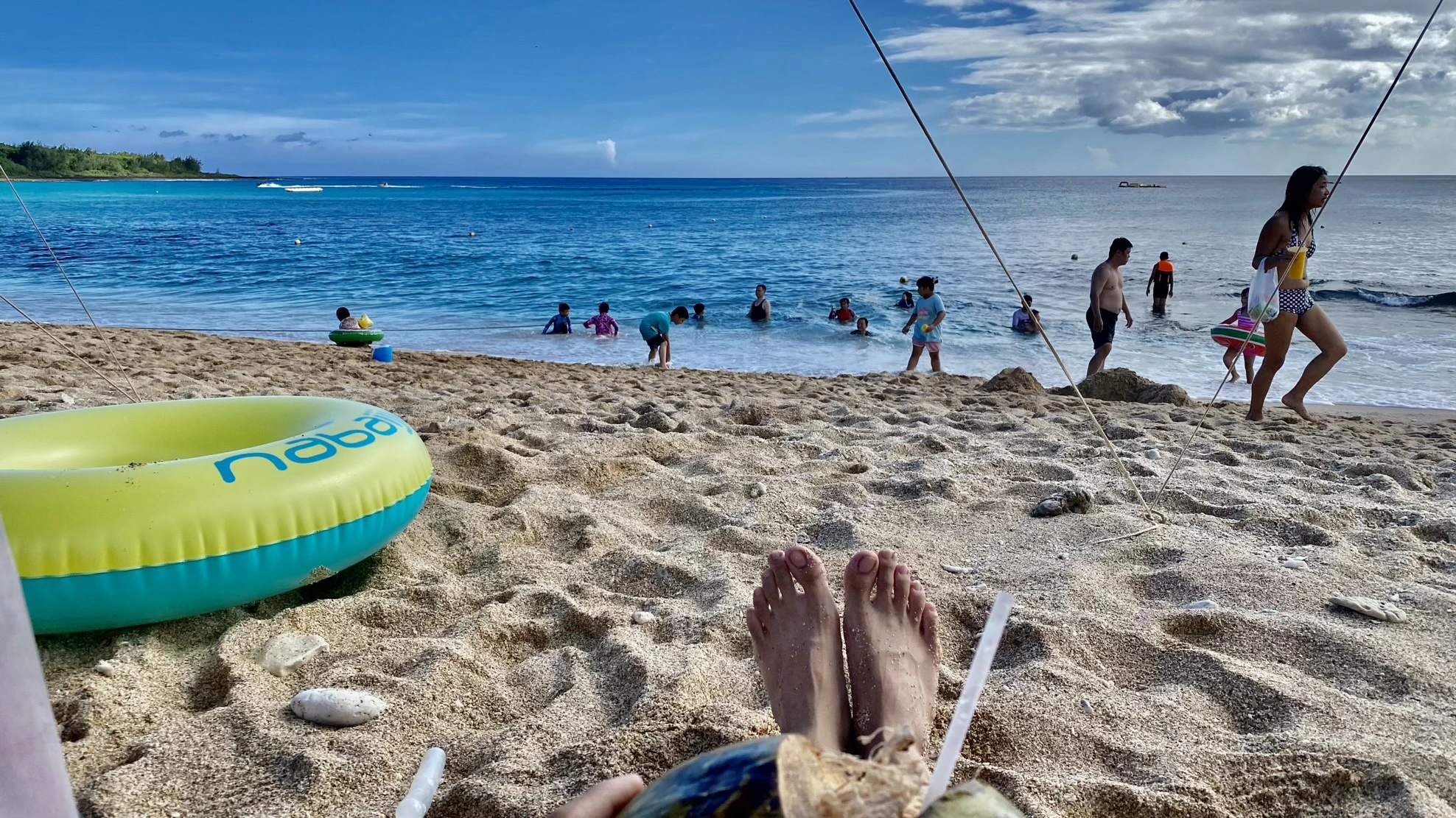
然而在 CSS 實現貝茲曲線一直都沒有一個優雅的方法。我在這個中秋連假和家人一起到墾丁露營,我一邊看著大海海浪一邊喝著椰子水思考這個問題…
突然我注意到,你看椰子是不是看起來很圓,但又不是很圓。像極了圓角 border-radius 接近 50% 但又還沒達到。
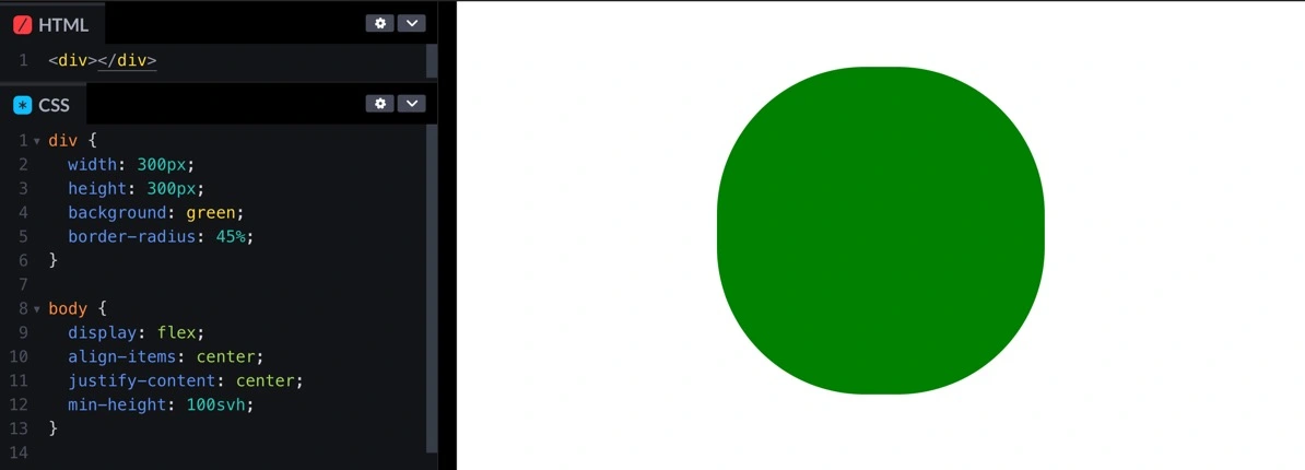
<div></div>div {
width: 300px;
height: 300px;
background: green;
border-radius: 45%;
}
body {
display: flex;
align-items: center;
justify-content: center;
min-height: 100svh;
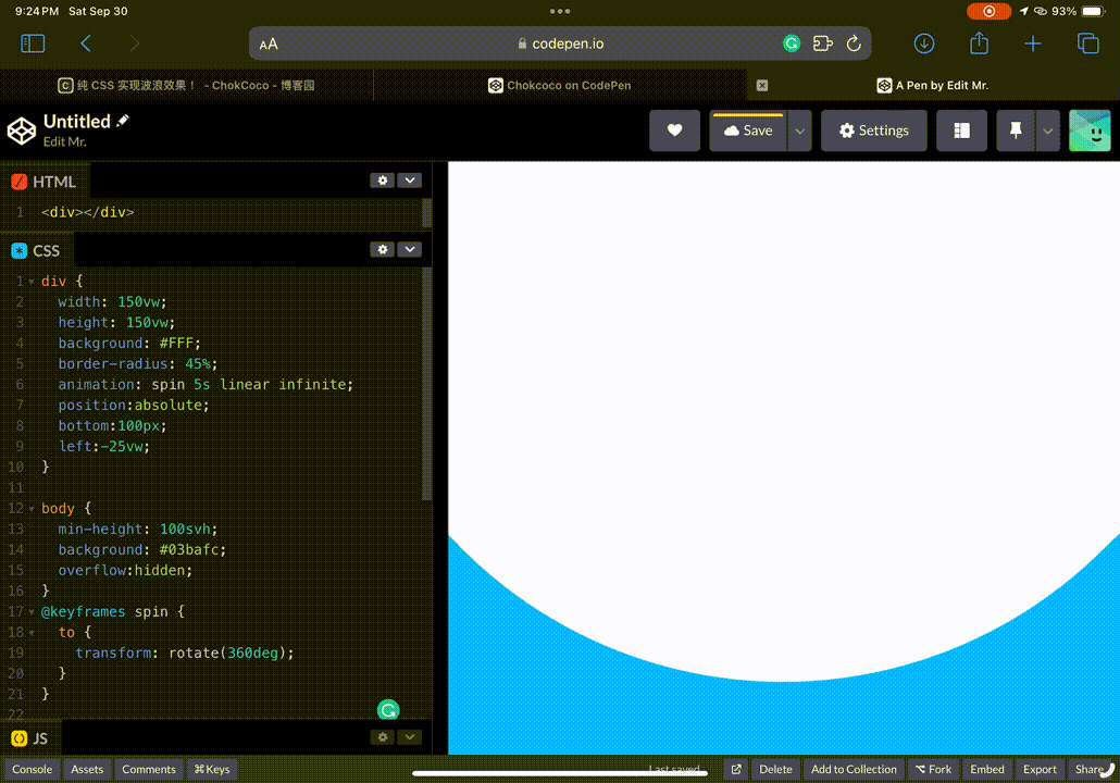
}如果把它轉起來的話…

div {
	width: 300px;
	height: 300px;
	background: green;
	border-radius: 45%;
	animation: spin 5s linear infinite;
}

@keyframes spin {
	to {
		transform: rotate(360deg);
	}
}是不是有點波浪的感覺?也有點像一些手機充電的動畫。我們就是要借助這個起伏製作出波浪動畫。而實際上要怎麼做呢?我們先把背景設定成藍色,接著把這個椰子放大好幾倍把這個海切出海浪。
https://codepen.io/elvismao/pen/dywjOyw
這裡關於置中我想補充一個點,就是因為我們已經在使用 transform: rotate() 屬性旋轉,所以我沒有用 translate()來置中。因為我們知道寬度是 150vw,所以只需要把多出來的 50vw 切一半丟到左邊就可以了。

最後來多疊幾個,然後裝飾一下它。成果如下:
https://codepen.io/elvismao/pen/JjwBbgg
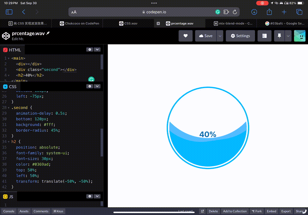
可以看出我有疊第二個,並且微調顏色圓角,並稍微延遲,讓他看起來不要過度整齊。外框是先疊一層白色 border,再一層藍色 outline。最後再加上一個文字,就完成了。
<main>
	<div></div>
	<div class="“second”"></div>
	<h2>40%</h2>
</main>body {
overflow: hidden;
display: flex;
justify-content: center;
align-items: center;
min-height: 100svh;
}
main {
width: 300px;
height: 300px;
background: #03bafc;
overflow: hidden;
border-radius: 50%;
border: 5px solid #fff;
outline: 5px solid #03bafc;
position: relative;
}
div {
width: 450px;
height: 450px;
background: #52bdff;
border-radius: 43%;
animation: spin 5s linear infinite;
position: absolute;
bottom: 100px;
left: -75px;
}
.second {
animation-delay: 0.5s;
bottom: 120px;
background: #fff;
border-radius: 45%;
}
h2 {
position: absolute;
font-family: system-ui;
font-size: 30px;
color: #0369ad;
top: 50%;
left: 50%;
transform: translate(-50%, -50%);
}
@keyframes spin {
to {
transform: rotate(360deg);
}
}以上就是我今天的分享,歡迎在 Instagram 和 Google 新聞追蹤毛哥EM資訊密技,也歡迎訂閱我新開的YouTube 頻道:網棧。
我是毛哥EM,讓我們明天再見。

毛哥EM


數位創作者,全端工程龍
