Day24 CSS 相融黏滯效果
 488
488
 3 min
3 min
 2023-10-08
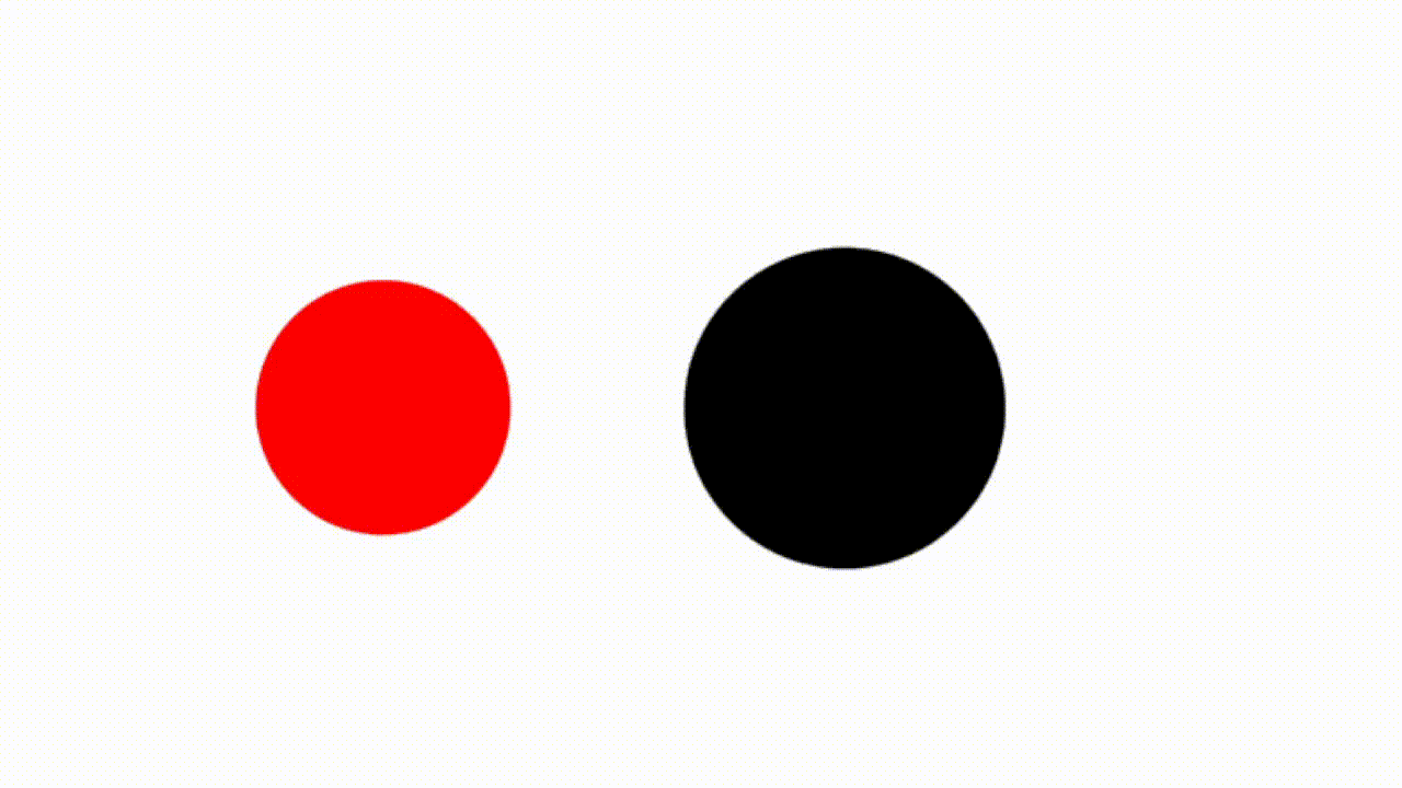
今天我們要來做這個紓壓的效果:
https://codepen.io/elvismao/pen/poqqoLr
然後你可以應用做出一些很酷的效果:
原理
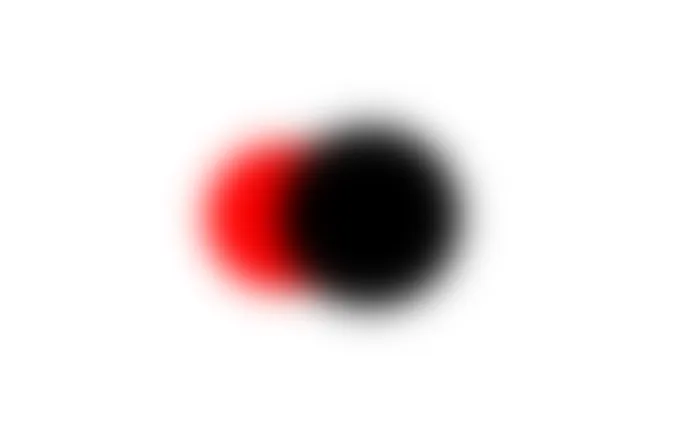
原理其實很簡單。要讓兩個東西之間相連只需要模糊就會糊在一起了。
<div class="box">
	<div class="circle-small"></div>
	<div class="circle-big"></div>
</div>.box {
position: relative;
height: 100vh;
background-color: #fff;
}
.circle-big,
.circle-small {
filter: blur(10px);
border-radius: 50%;
width: 80px;
height: 80px;
background-color: red;
position: absolute;
left: 50%;
top: 50%;
transform: translate(-50%, -50%);
}
.circle-big {
width: 100px;
height: 100px;
background-color: black;
transform: translate(0, -50%);
}然後增加對比讓中間模糊的部分更明顯:
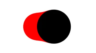
.box {
	position: relative;
	height: 100vh;
	background-color: #fff;
	filter: contrast(20);
}最後讓它動起來
.box {
	position: relative;
	height: 500px;
	filter: contrast(20);
	background-color: #fff;
}
.circle-big,
.circle-small {
	border-radius: 50%;
	filter: blur(10px);
	animation: 2s infinite move alternate;
	width: 80px;
	height: 80px;
	background-color: red;
	transform: translatex(20px);
	position: absolute;
	left: 50%;
	top: 50%;
	transform: translate(-50%, -50%);
}
.circle-big {
	width: 100px;
	height: 100px;
	background-color: black;
	animation-delay: -2s;
}

@keyframes move {
	from {
		transform: translate(calc(-50% + 100px), -50%);
	}
	to {
		transform: translate(calc(-50% - 100px), -50%);
	}
}好,結束。
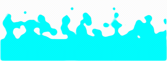
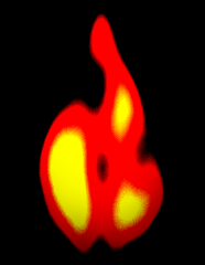
你可以自由應用在你的網頁上。以下是幾個範例:
來源:https://codepen.io/Chokcoco
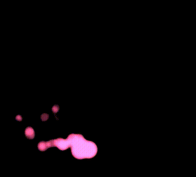
連結:https://codepen.io/YusukeNakaya/pen/vvEqVx
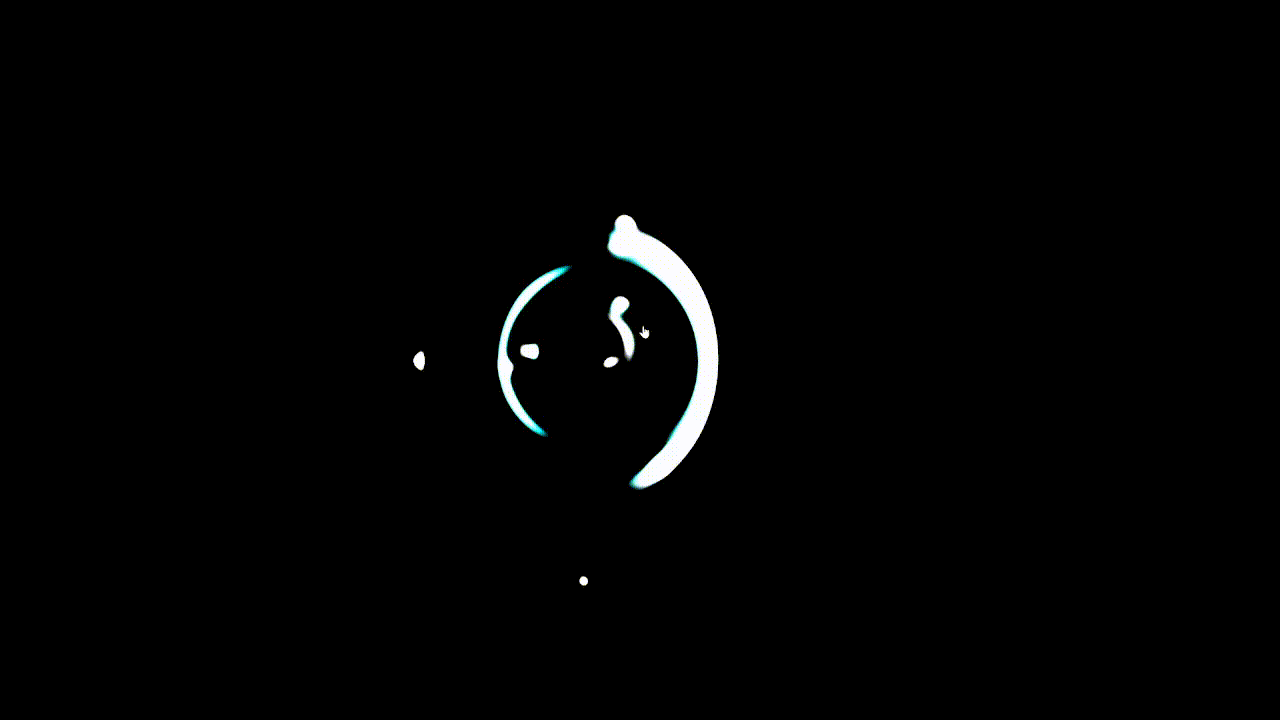
這個效果明天會使用到,你可以來猜猜看。我剩下六天了,接下來原則上都是蠻重要的內容,要來完成一些很常見的版面和許多人習慣直接套庫的東西。以上就是我今天的分享,歡迎在 Instagram 和 Google 新聞追蹤毛哥EM資訊密技,也歡迎訂閱我新開的YouTube 頻道:網棧。
我是毛哥EM,讓我們明天再見。

毛哥EM


數位創作者,全端工程龍
