Day25 有料的 CSS 漢堡選單
 1.7k
1.7k
 8 min
8 min
 2023-10-09
我們今天要來做幾份漢堡選單。
原理和 Day14 今天我想來點… 純 CSS 的開關 一樣,都是用 input 的 checkbox 來儲存狀態好讓其他元素可以抓到。而他本身的狀態使用 label 來遠端遙控。
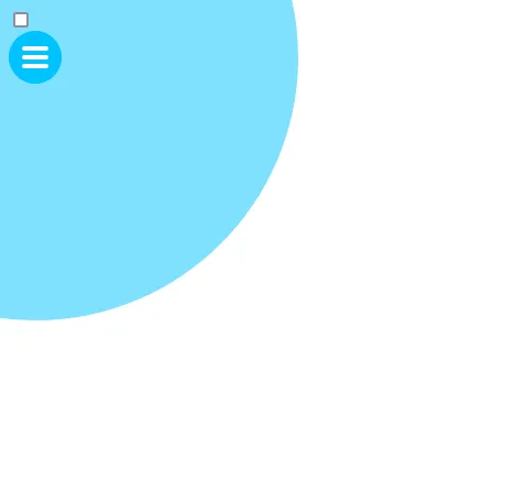
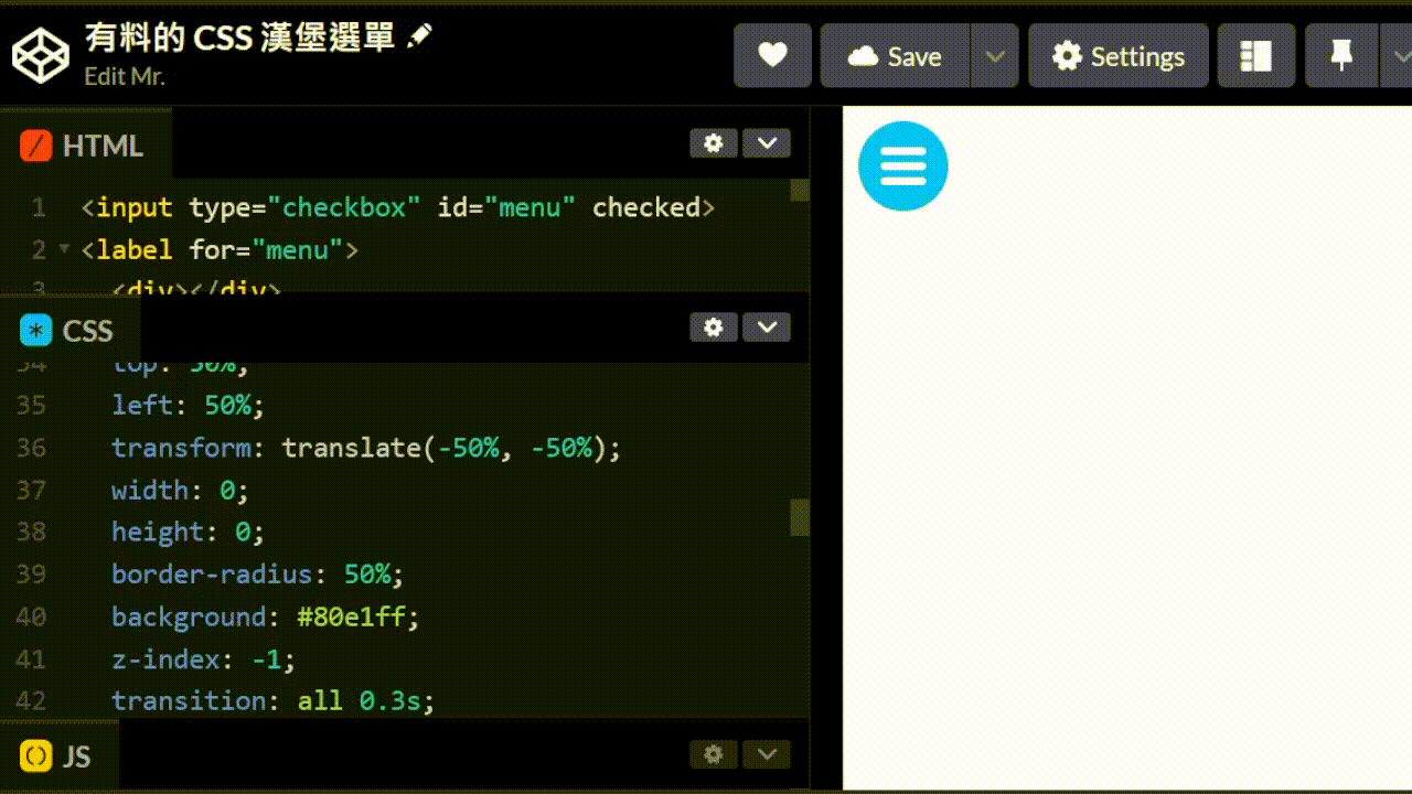
我先不要一次跳太多步驟。這是一個基本還未完成的版面。
<input type="checkbox" id="menu" />
<label for="menu">
	<div></div>
	<div></div>
	<div></div>
	<span class="cover"></span>
</label>label {
width: 3rem;
height: 3rem;
background: #00c3ff;
display: block;
border-radius: 50%;
display: flex;
flex-direction: column;
align-items: center;
justify-content: center;
gap: 0.25em;
position: relative;
}
label div {
width: 1.5rem;
height: 0.25rem;
background: #fff;
border-radius: 0.25rem;
}
.cover {
position: absolute;
display: block;
top: 50%;
left: 50%;
transform: translate(-50%, -50%);
width: 100vmax;
height: 100vmax;
border-radius: 50%;
background: #80e1ff;
z-index: -1;
}可以看到我們已經有了漢堡選單的樣子。<label> 使用 flex 來垂直排列並且置中,gap 來設定間距,並設定 position: relative 來讓 position: absolute 的 .cover 可以定位到相同位置。
如果已經看不懂的話可以複習:
藍色圓形我們希望能夠填滿整個畫面,所以我們使用 100vmax 來選擇 vw 和 vh 之間比較大的值,這樣可以確保能夠蓋滿畫面但是長寬還是依樣來保持圓形。你會發現只有蓋住螢幕一半是因為我們把她往左上角移動了一半,所以只有一半的圓形在畫面上。沒關係我們為了安全起見設定大一點。最後使用 z-index 來讓他在最底層。
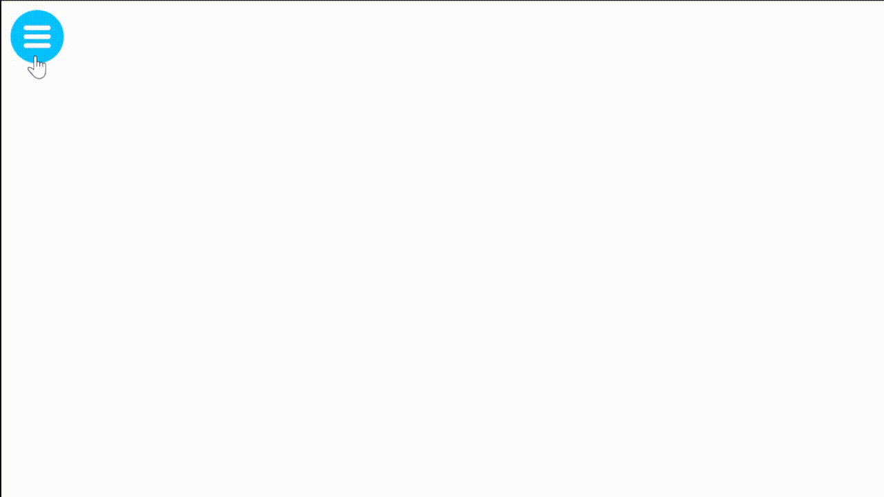
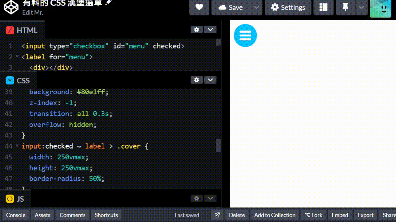
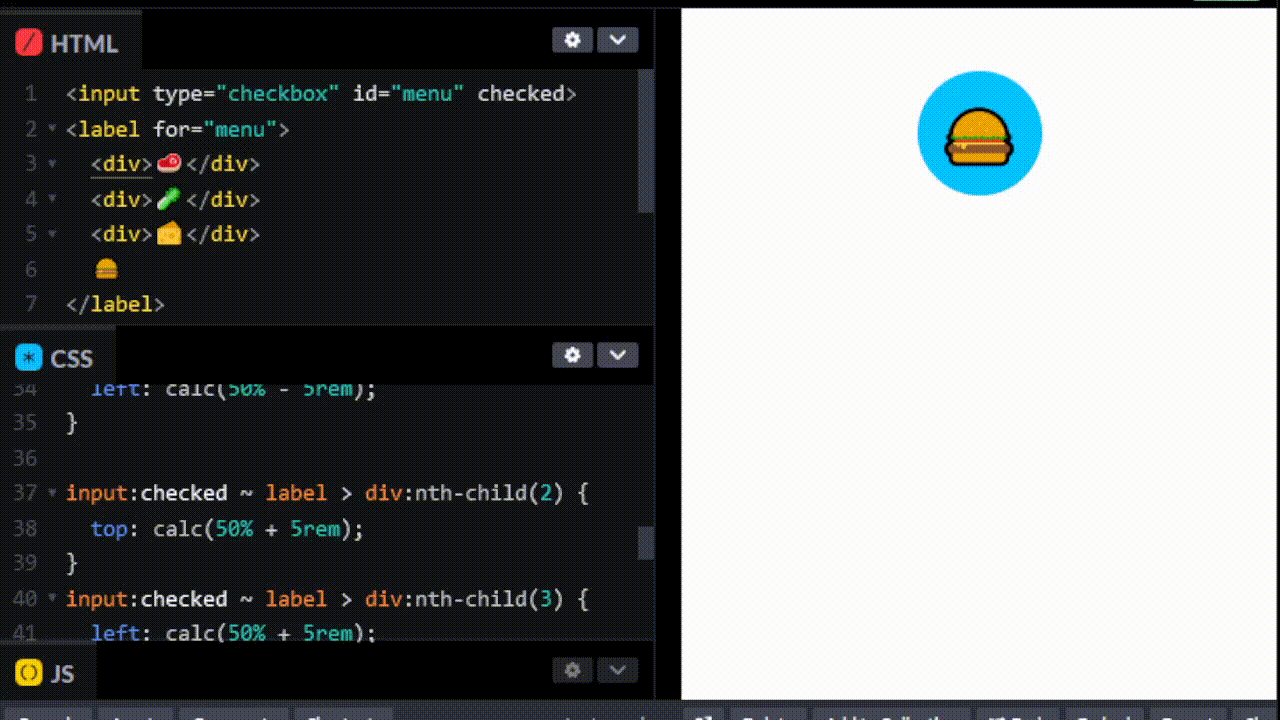
把原本的勾選框隱藏起來再加上內文。漢堡選單裡面當然就是要放漢堡配料,效果如下
<input type="checkbox" id="menu" checked />
<label for="menu">
	<div></div>
	<div></div>
	<div></div>
	<span class="cover">
		<ul>
			<li>麵包</li>
			<li>肉排</li>
			<li>青菜</li>
			<li>麵包</li>
		</ul>
	</span>
</label>body {
overflow: hidden;
font-family: system-ui;
}
input[type="checkbox"] {
display: none;
}
label {
width: 3rem;
height: 3rem;
background: #00c3ff;
display: block;
border-radius: 50%;
display: flex;
flex-direction: column;
align-items: center;
justify-content: center;
gap: 0.25em;
position: relative;
cursor: pointer;
}
label div {
width: 1.5rem;
height: 0.25rem;
background: #fff;
border-radius: 0.25rem;
transition: all 0.3s;
}
.cover {
position: absolute;
display: block;
top: 50%;
left: 50%;
transform: translate(-50%, -50%);
width: 0;
height: 0;
border-radius: 50%;
background: #80e1ff;
z-index: -1;
transition: all 0.3s;
overflow: hidden;
}
input:checked ~ label > .cover {
width: 250vmax;
height: 250vmax;
border-radius: 50%;
}
ul {
position: absolute;
top: 50%;
left: 50%;
width: 100vw;
color: #fff;
font-size: 3em;
list-style: none;
font-weight: 700;
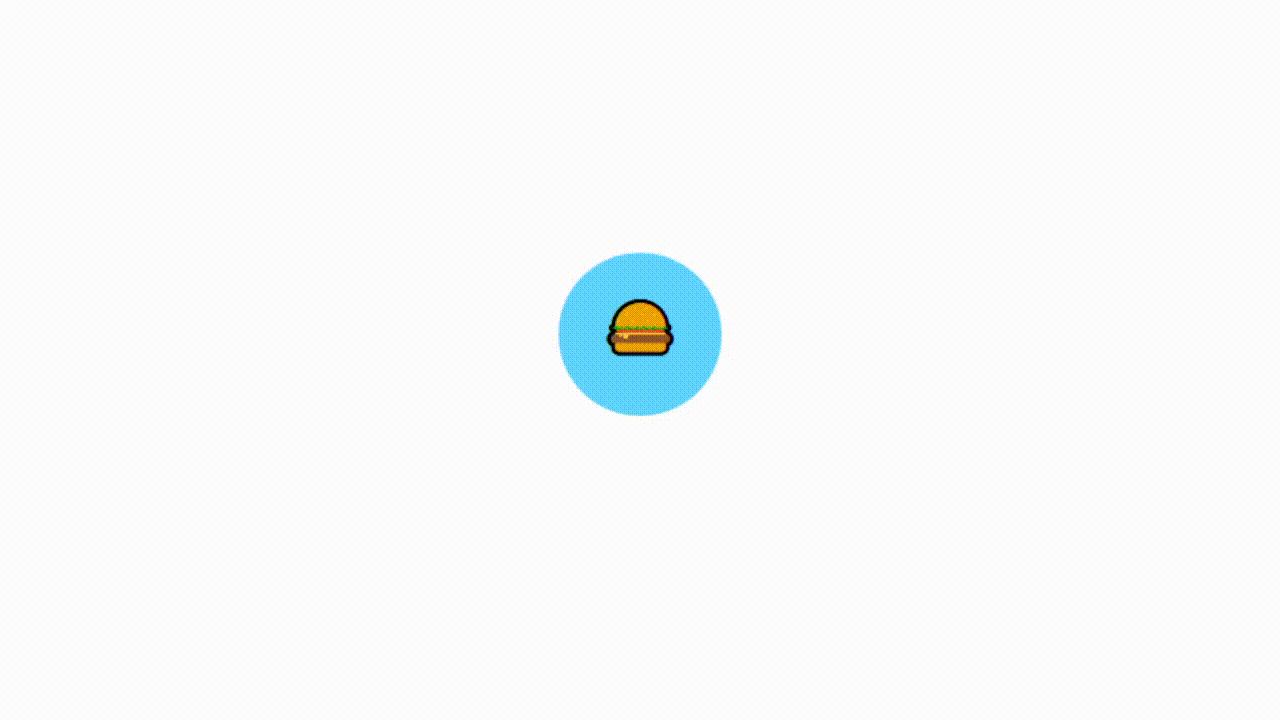
}最後是漢堡動畫,這裡就要發揮你自己的創意了。原理不難,這裡提供一個我現在想到的做法。我想要最上面的和最下面的旋轉 45 度,中間的變短到消失。所以我們先把中間的設定 width: 0; height: 0; ,然後我們把最上面的和最下面的設定 transform: rotate(45deg);,這樣就會旋轉 45 度了。這樣能夠做出一個箭頭:
input:checked ~ label > div:first-child {
	transform: rotate(-45deg);
}
input:checked ~ label > div:nth-child(2) {
	width: 0;
}
input:checked ~ label > div:nth-child(3) {
	transform: rotate(45deg);
}再來做一個也很常見的打叉,為了方便我們乾脆全部使用 absolute 定位。成果如下:
https://codepen.io/elvismao/pen/zYyyEgz
body {
	overflow: hidden;
	font-family: system-ui;
}
input[type="checkbox"] {
	display: none;
}
label {
	width: 3rem;
	height: 3rem;
	background: #00c3ff;
	display: block;
	border-radius: 50%;
	position: relative;
	cursor: pointer;
}

label div {
	position: absolute;
	width: 1.5rem;
	height: 0.25rem;
	background: #fff;
	border-radius: 0.25rem;
	transition: all 0.3s;
	top: 50%;
	left: 50%;
	transform: translate(-50%, -50%);
}
.cover {
	position: absolute;
	display: block;
	top: 50%;
	left: 50%;
	transform: translate(-50%, -50%);
	width: 0;
	height: 0;
	border-radius: 50%;
	background: #80e1ff;
	z-index: -1;
	transition: all 0.3s;
	overflow: hidden;
}
input:checked ~ label > .cover {
	width: 250vmax;
	height: 250vmax;
	border-radius: 50%;
}

ul {
	position: absolute;
	top: 50%;
	left: 50%;
	width: 100vw;
	color: #fff;
	font-size: 3em;
	list-style: none;
	font-weight: 700;
}
input:checked ~ label div:first-child {
	left: 25%;
	top: 50%;
	transform: rotate(45deg);
}
input:checked ~ label div:nth-child(2) {
	width: 0;
}
input:checked ~ label div:nth-child(3) {
	left: 25%;
	top: 50%;
	transform: rotate(-45deg);
}
label > div:first-child {
	top: calc(50% - 0.5rem);
}
label > div:nth-child(3) {
	top: calc(50% + 0.5rem);
}你以為這樣就結束了?還記得我們昨天講的 Day24 CSS 相融黏滯效果 嗎?我們可以把他加上去讓他更有質感。
這是一個會四處噴射漢堡選單
<input type="checkbox" id="menu" checked />
<label for="menu">
	<div>🥩</div>
	<div>🥬</div>
	<div>🧀</div>
	🍔
</label>body {
overflow: hidden;
font-family: system-ui;
}
input[type="checkbox"] {
display: none;
}
label {
width: 5rem;
height: 5rem;
background: #00c3ff;
display: block;
border-radius: 50%;
position: relative;
cursor: pointer;
margin: 1em auto;
}
div {
position: absolute;
top: 50%;
left: 50%;
transform: translate(-50%, -50%);
width: 3rem;
height: 3rem;
border-radius: 50%;
background: #00c3ff;
z-index: -1;
transition: all 0.3s;
overflow: hidden;
}
input:checked ~ label > div:nth-child(1) {
left: calc(50% - 5rem);
}
input:checked ~ label > div:nth-child(2) {
top: calc(50% + 5rem);
}
input:checked ~ label > div:nth-child(3) {
left: calc(50% + 5rem);
}
label,
div {
display: flex;
align-items: center;
justify-content: center;
font-size: 2.5rem;
user-select: none;
}
div {
font-size: 1.5rem;
}
user-select: none;可以讓使用者無法選取文字,這樣就不會在點擊時有文字被選取的問題了。
加上昨天的相黏效果,變得更可愛了。
https://codepen.io/elvismao/pen/NWeeYRq
body {
	overflow: hidden;
	font-family: system-ui;
	min-height: 100svh;
}
input[type="checkbox"] {
	display: none;
}
label {
	width: 5rem;
	height: 5rem;
	display: block;
	position: absolute;
	cursor: pointer;
	left: 50%;
	transform: translate(-50%, -50%);
}
.box div {
	width: 4rem;
	height: 4rem;
}
.box div,
label {
	top: 50%;
	border-radius: 50%;
	background: #00c3ff;
}
.box div,
.food,
.food div {
	position: absolute;
	left: 50%;
	transform: translate(-50%, -50%);
	transition: 0.3s;
}
input:checked ~ .box div:first-child,
input:checked ~ .food div:first-child {
	left: calc(50% - 4rem);
}
input:checked ~ .box div:nth-child(2),
input:checked ~ .food div:nth-child(2) {
	top: calc(50% + 4rem);
}
input:checked ~ .box div:nth-child(3),
input:checked ~ .food div:nth-child(3) {
	left: calc(50% + 4rem);
}
.box div,
label {
	user-select: none;
	filter: blur(10px);
}
.box {
	background: #fff;
	filter: contrast(20) hue-rotate(45deg);
	height: 100svh;
}
.food,
.food div {
	top: 50.3%;
	user-select: none;
	pointer-events: none;
}
input:checked ~ .food div {
	font-size: 1.5rem;
}
.food div {
	font-size: 0rem;
}
.food div:last-child {
	font-size: 2rem;
}手機版的淘寶之前有使用過類似的效果製作分享選單喔~
因為相黏效果有先模糊,裡面的 Emoji 文字也會被模糊,所以我們在後面又做一個只有文字的 .food 來顯示文字。設定 pointer-events: none 就可以讓他不會被點擊到了,直接穿透去點擊下面的 label。
背景顏色一定要記得設定,不然只會糊再一起沒有相黏效果。這是我 debug 半小時之後才想到的...
以上就是我今天的分享,歡迎在 Instagram 和 Google 新聞追蹤毛哥EM資訊密技,也歡迎訂閱我新開的YouTube 頻道:網棧。
我是毛哥EM,讓我們明天再見。

毛哥EM


數位創作者,全端工程龍
