Day 27 iT 邦幫忙::一起幫忙製作導覽列,拯救第 27 天
 1.2k
1.2k
 6 min
6 min
 2023-10-11
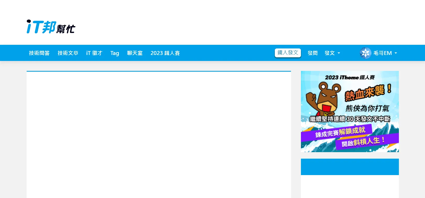
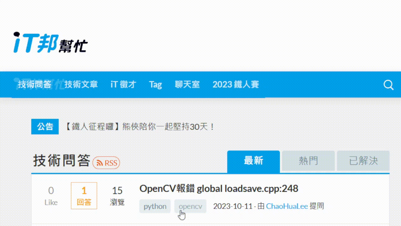
今天我們要來製作 iT 邦幫忙首頁的導覽列。我們先來看看原本的網站。
呃好喔...晚點再看看...
沒事我有先截圖。
你有注意到嗎?第二排的導覽列在往下滾之後會固定在上方,並顯示出縮小版的 Logo。我覺得蠻可愛的,一個好的 UI 就事要有這種平常不會注意但讓體驗很順暢舒服的小巧思。我們來搭配昨天的 Animate On Scroll 原理來製作吧。
基本版面
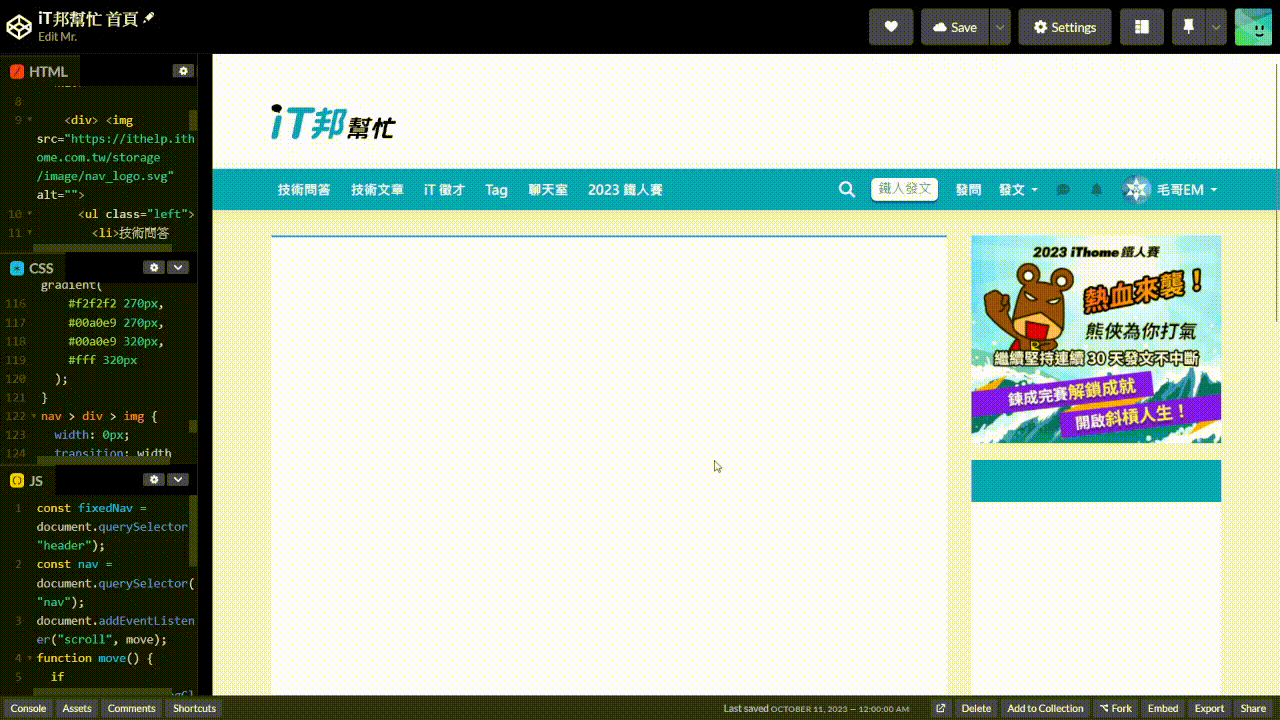
首先我們先做一個類似於 iT 邦幫忙首頁的版面。這應該是這個系列最多的 HTML 了。
<main>
  <header class="header">
    <div>
      <img src="https://ithelp.ithome.com.tw/storage/image/logo.svg" alt="">
    </div>
  </header>
  <nav>
    <div>
      <li>技術問答</li>
      <li>技術文章</li>
      <li>iT 徵才</li>
      <li>Tag</li>
      <li>聊天室</li>
      <li>2023 鐵人賽</li>
      </ul>
      <ul class="right">
        <li><i class="fa-solid fa-magnifying-glass"></i></li>
        <li><button>鐵人發文</button></li>
        <li>發問</li>
        <li>發文 <span class="caret"></span></li>
        <li><i class="fa fa-commenting fa-fw button"></i></li>
        <li><i class="fa fa-bell fa-fw button"></i></li>
        <li class="pro"><img src="https://member.ithome.com.tw/avatars/161968?s=ithelp" alt="">毛哥EM<span class="caret"></span></li>
      </ul>
    </div>
  </nav>
  <div>
    <section></section>
    <aside><img src="https://ithelp.ithome.com.tw/static/2023ironman/img/ironman-banner.gif" alt=""></aside>
  </div>
</main>* {
margin: 0;
padding: 0;
box-sizing: border-box;
}
body {
background: #f2f2f2;
font-family: system-ui;
}
header > div,
nav > div,
main > div {
padding: 15px;
max-width: 1170px;
margin: 0 auto;
}
header {
background: #fff;
}
header img {
width: 14%;
margin-top: 45px;
margin-bottom: 16px;
padding-right: 10px;
}
.fixedNav {
margin-bottom: 50px;
}
nav {
width: 100%;
background-color: #00a0e9;
box-shadow: 0 3px 12px rgba(0, 0, 0, 0.1);
}
nav > div {
min-height: 50px;
display: flex;
align-items: center;
color: #fff;
font-weight: 700;
padding: 0 10px;
}
li {
display: inline-block;
padding: 0 12px;
display: flex;
align-items: center;
gap: 6px;
}
i {
font-size: 1.2em;
}
.button {
color: #0f6b95;
font-size: 1em;
}
.caret {
display: inline-block;
margin-left: 2px;
border-top: 4px solid;
border-right: 4px solid transparent;
border-left: 4px solid transparent;
}
ul {
display: flex;
align-items: center;
}
button {
font-family: system-ui;
display: block;
padding: 2px 8px 5px;
box-shadow: 0px 2px 1px 1px #00637d;
background-color: #ffffff;
color: #1b79a2;
border-radius: 6px;
font-size: 16px;
outline: none;
border: none;
}
.right {
justify-content: flex-end;
flex-grow: 1;
}
.right li {
padding: 0 10px;
}
li img {
border-radius: 50%;
width: 36px;
height: 36px;
}
aside {
width: 300px;
}
aside,
section {
background: #fff;
height: 200vh;
}
main > div {
display: flex;
gap: 30px;
padding-top: 30px;
}
section {
flex-grow: 1;
border-top: 3px solid #00a0e9;
}
aside {
background: linear-gradient(#f2f2f2 270px, #00a0e9 270px, #00a0e9 320px, #fff 320px);
}大概講幾個有趣的點:
- 圖片來源是 Font Awesome
<aside>裡面的背景是用linear-gradient做的。先是背景灰色,然後是藍色、白色。感覺像是分成不同元素但為了方便就用一個漸層充當。- 設定
max-width: 1170px再加上margin: 0 auto來讓版面置中。
其他的沒什麼特別的。如果看不懂的話可以複習 Day3 用 Flex 切遍天下
JavaScript
接下來寫 JavaScript,先抓白底標題元素。
const white = document.querySelector("header");滾動時,如果導覽列底部超出視窗,就給藍色選單加上 .fixedNav 這個 class。如果沒有就會移除。
document.addEventListener("scroll", () => white.classList.toggle("fixedNav", white.getBoundingClientRect().bottom < 0));
element.classList.toggle會在 class 存在時移除,不存在時加上。如果填寫兩個參數,第一個是要添加或移除的 class;第二個參數是布林值,會在布林值為 true 時加上,false 時移除。
滾動效果
固定導覽列
ok 最後來補上一點 CSS。先是讓導覽列固定在最上方。
.fixedNav + nav {
	position: fixed;
	top: 0;
	left: 0;
}然後因為導覽列固定在上方,原本的空間會被往上移導致被遮住。所以要白色標題底下加上 margin-bottom 來填滿原本的空間。
.fixedNav {
  margin-bottom: 50px;
}滑出圖片
HTML 加上圖片
<nav>
	<div>
		<img src="https://ithelp.ithome.com.tw/storage/image/nav_logo.svg" alt="" />
		<ul class="left">

		</ul>
	</div>
</nav>iT 邦幫忙的作法是把右邊的選單用 transform:translate() 往左平移遮住它。我把上面的選單設成半透明讓你看。
這個方法很不錯,但我今天想和你分享另外一個做法。就是直接使用 width 控制。
nav > div > img {
	width: 0px;
	transition: width 0.2s linear;
	object-fit: cover;
	object-position: left;
	height: 24px;
}
.fixedNav + nav > div > img {
	width: 109px;
}object-fit 可以讓圖片填滿容器,而不會變形。object-position 可以讓圖片往左對齊而不是中間。這樣就可以做到圖片從左邊滑出來的效果。
成果
成果如下
https://codepen.io/elvismao/pen/WNLPYON
以上就是我今天的分享,歡迎在 Instagram 和 Google 新聞追蹤毛哥EM資訊密技,也歡迎訂閱我新開的YouTube 頻道:網棧。
我是毛哥EM,讓我們明天再見。

毛哥EM


數位創作者,全端工程龍
