Day5 載入中… Animation-delay
 1.1k
1.1k
 5 min
5 min
 2023-09-19

假設你今天想製作這個載入動畫…
https://codepen.io/elvismao/pen/YzdzvdV
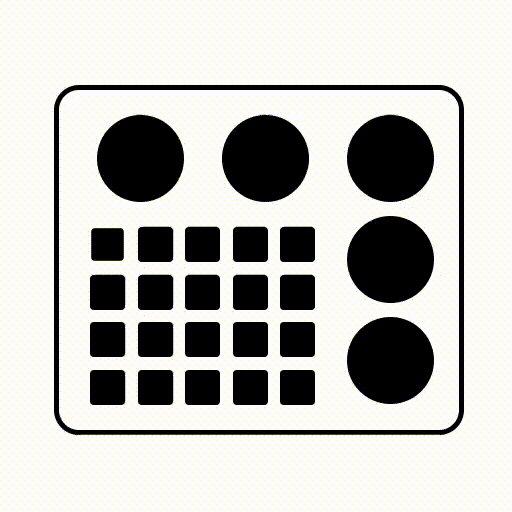
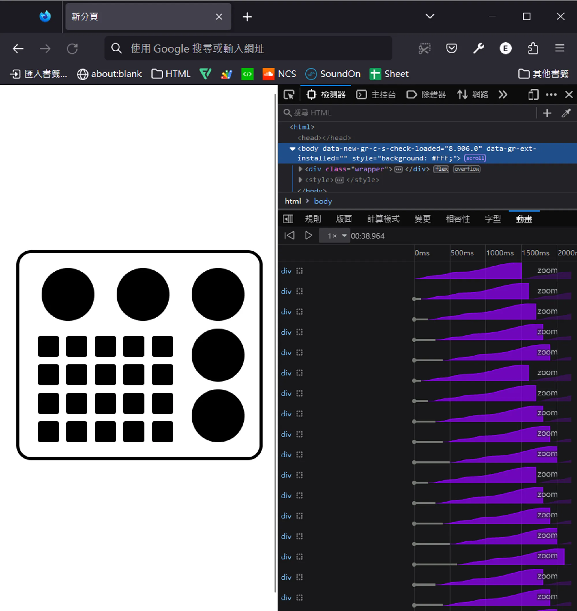
可以看出來每個方塊的縮放速度是一樣的,只是越往右下就越有延遲對吧。昨天我們學到可以在 animation 設定延遲,其實也可以在 animation-delay 個別設定。讓我們來一步步用前面幾天學到的知識做出這個動畫吧。
用 flex 切版
在想要怎麼切板時可以尋找找齊排列的矩形來群組。以下是我想到的切版方式。
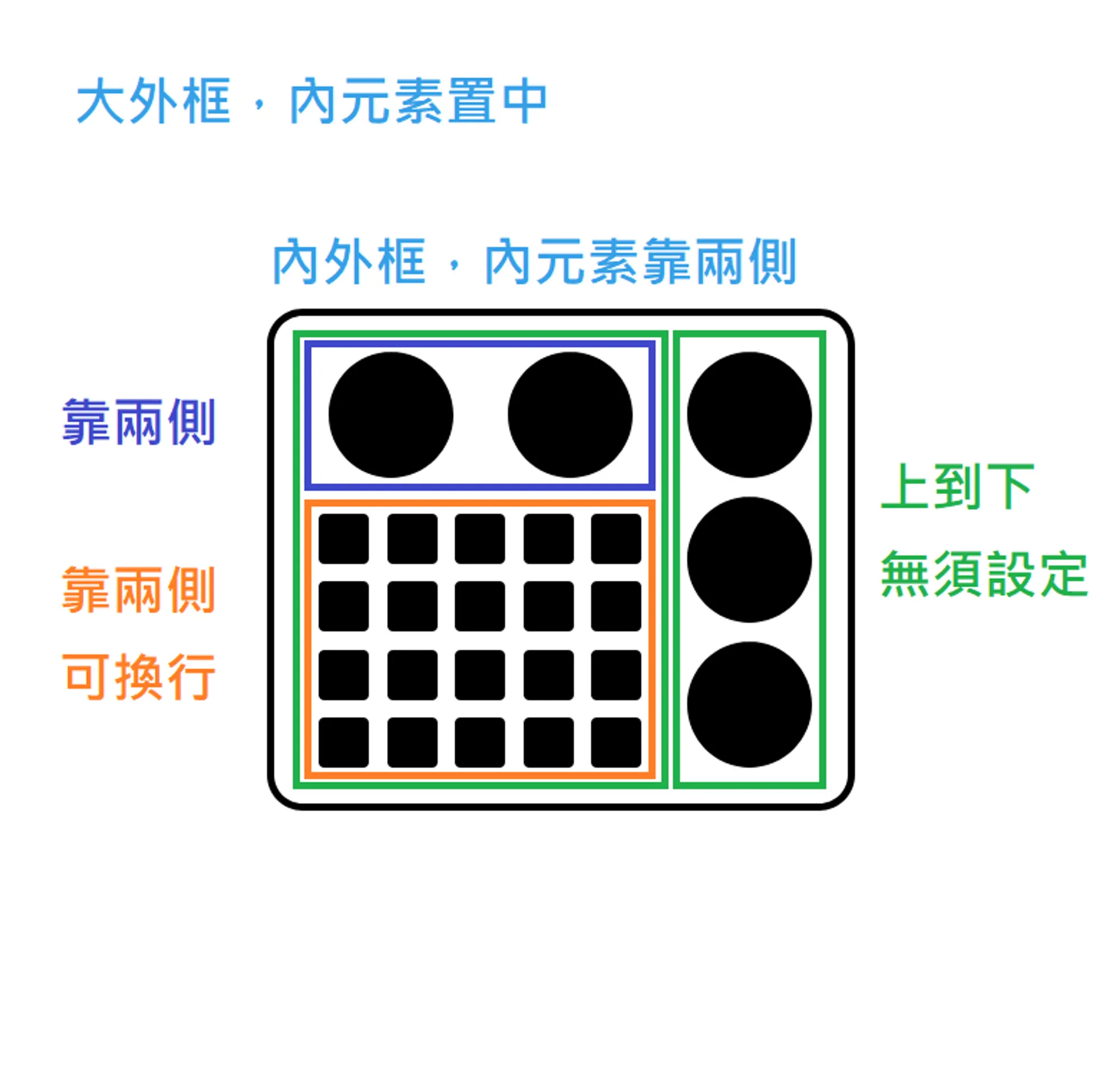
不知道這樣你知道如何下手了嗎?
我們先寫 HTML。emmet 縮寫如下。
main>(.left>(.wheelBox>.wheel*2)+.box>div*25)+.right>.wheel*3CSS 設定一下寬高、形狀、與排列方式
提示:
border-radius設定大於等於50%即可生成圓形
.box div,
.wheel {
	background-color: #000;
}
body {
	height: 100vh;
	display: flex;
	justify-content: center;
	align-items: center;
}
main {
	width: 300px;
	border: 4px solid #000;
	display: flex;
	border-radius: 20px;
	padding: 10px;
}
.wheel {
	width: 70px;
	height: 70px;
	border-radius: 50%;
}
.box,
.right,
.wheelBox {
	display: flex;
	justify-content: center;
	align-items: center;
	gap: 10px;
	flex-wrap: wrap;
	padding: 10px;
}
.wheelBox {
	justify-content: space-between;
	padding: 10px 20px;
}
.box div {
	width: 28px;
	height: 28px;
	border-radius: 3px;
	transform: scale(1);
	animation: 1.5s ease-in-out infinite zoom;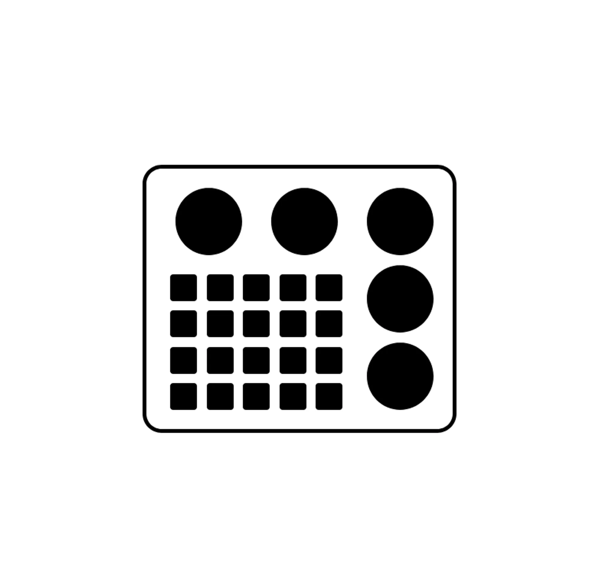
}這樣就有靜態的外觀了
方塊得動畫我們設成
animation: 1.5s ease-in-out infinite zoom;代表他會無限重複,每次 1.5 秒。我們來建立 zoom 的動畫吧,我們先縮小、放大、然後維持在原尺寸直到動畫結束。
@keyframes zoom {
	0% {
		transform: scale(1);
	}
	20% {
		transform: scale(0.7);
	}
	40% {
		transform: scale(1);
	}
}重複的 CSS 可以縮寫在一起,像這樣
@keyframes zoom {
	0%,
	40% {
		transform: scale(1);
	}
	20% {
		transform: scale(0.7);
	}
}你就會得到一個同時縮放的動畫。我們希望它可以有海浪滾動的感覺,所以越右下角延遲應該要越大。
我們在 HTML 用行內 CSS 個別設定元素的延遲就可以了。可以使用 Emmet 生成再微調。
<div class="box">
	<div style="animation-delay: .0s"></div>
	<div style="animation-delay: .1s"></div>
	<div style="animation-delay: .2s"></div>
	<div style="animation-delay: .3s"></div>
	<div style="animation-delay: .4s"></div>
	<div style="animation-delay: .1s"></div>
	<div style="animation-delay: .2s"></div>
	<div style="animation-delay: .3s"></div>
	<div style="animation-delay: .4s"></div>
	<div style="animation-delay: .5s"></div>
	<div style="animation-delay: .2s"></div>
	<div style="animation-delay: .3s"></div>
	<div style="animation-delay: .4s"></div>
	<div style="animation-delay: .5s"></div>
	<div style="animation-delay: .6s"></div>
	<div style="animation-delay: .3s"></div>
	<div style="animation-delay: .4s"></div>
	<div style="animation-delay: .5s"></div>
	<div style="animation-delay: .6s"></div>
	<div style="animation-delay: .7s"></div>
</div>這樣就能夠做出最上面的動畫啦!如果你跟我一樣使用 Firefox Developer Edition,在偵錯工具可以看到動畫時間軸曲線。
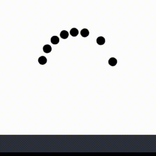
再來一個小練習吧,來做一個圓圈載入 loading 動畫
圓圈 Loading 動畫
https://codepen.io/elvismao/pen/LYMZeZE?editors=1100
有點像 Windows 更新動畫。首先我們先來製作圓圈。我畫了一張圖希望讓你更好理解。
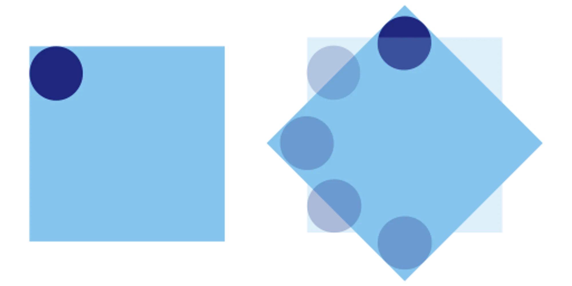
我們把一個正方形放在畫面中間,並在裡面放入一個圓形。只要讓正方形旋轉裡面的圓形就會做圓周運動。我們只需要多疊幾個,並設定動畫的延遲及持續時間即可做出這個動畫。
旋轉動畫很簡單:
@keyframes spin {
	to {
		transform: rotate(360deg);
	}
}在正方形上面套用,讓他無限旋轉。預設速度 ease 又漸入漸出效果。
animation: spin 2s infinte;我有在正方形裡面再包一層正方形,讓我可以讓每個正方形再旋轉一點,使每一個的開始點和結束點不太一樣。所有的參數你都可以調整看看。
HTML Emmet 如下:
.loading>(div[style="animation-delay: calc(.1s * $)"]>div[style="transform:rotate(calc(-15deg * $))"])*8以上就是我今天的分享,歡迎在 Instagram 和 Google 新聞追蹤毛哥EM資訊密技,也歡迎訂閱我新開的YouTube 頻道:網棧。
我是毛哥EM,讓我們明天再見。

毛哥EM


數位創作者,全端工程龍
