
今天是第二十一天,已經走完 2/3 的路程,我媽還以為我早被淘汰了。這個系列明明是叫【不用庫 也能酷 - 玩轉 CSS & Js 特效】,但 Js 出現了幾篇?有五篇嗎?難道 JavaScript 是來湊關鍵字的嗎?今天就來聊聊為甚麼使用純 CSS 做效果如此吸引人。
對手進場
CSS transition 和 @keyframes
就性能上來說兩者基本上沒有區別,所以我們都歸於 CSS 動畫。你可以根據使用情境來選擇使用哪一種。比如說滑鼠互動可以使用 transition,出場動畫可以使用 @keyframes。
JavaScript requestAnimationFrame()
requestAnimationFrame() 會在瀏覽器畫下一幀繪制之前調用。因此比設定固定時間重繪的 setTimeout() 或 setInterval()效率高得多。開發人員可以通過簡單地改變元素的樣式(或者更新畫布繪制等等)來建立動畫。
備註:不管是 CSS 動畫還是 JavaScript 動畫,如果你離開目前的頁面,動畫就會停止。比如說 Day10 永無止境跑馬燈 - 不同螢幕 相同速度 的跑馬燈就是如此。
如果你想要在背景執行動畫,可以使用 Web Worker。
就是要對決
我這裡使用 FireFox Developer Edition 來測試,因為它在 CSS Debug 有很多很棒的功能。而今天我們要讓他幫助我們看到動畫的 FPS。
用 Firefox 還有一個原因是他在隱私權保護方面抓得很緊,所以在 Firefox 上面能用基本上 Chromium 都不會有太大問題。
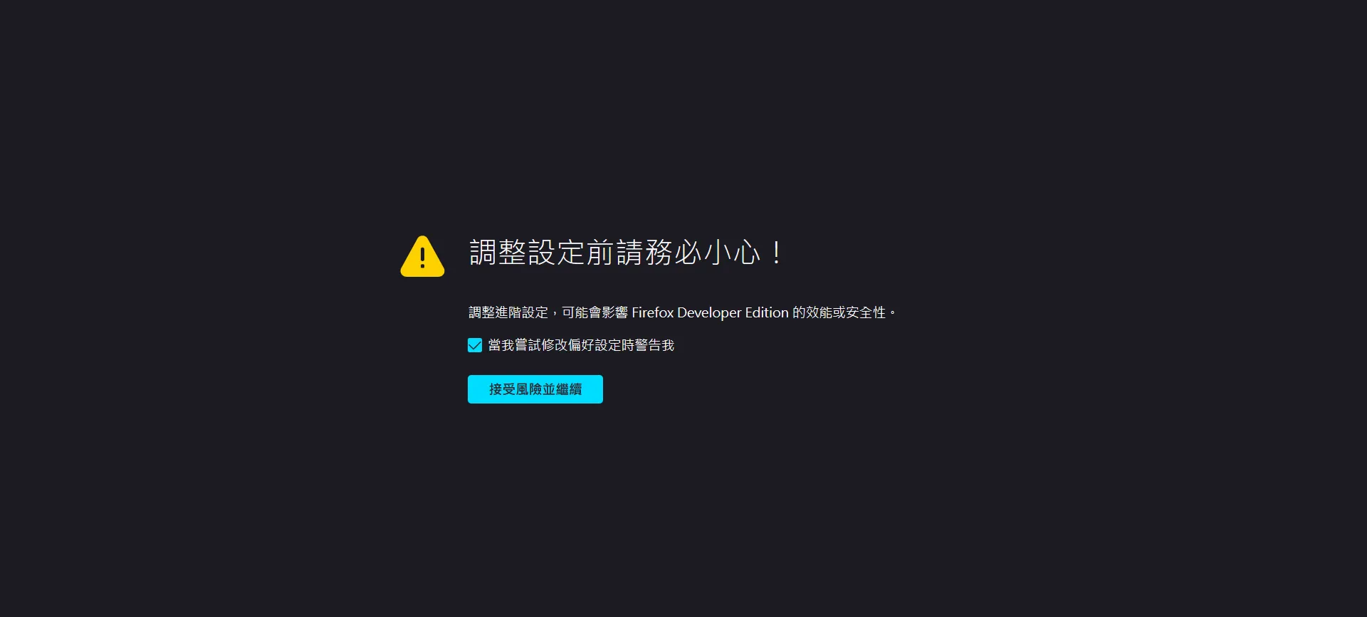
首先請你先到about:config,他很貼心請你要小心,選擇接受風險並繼續即可。
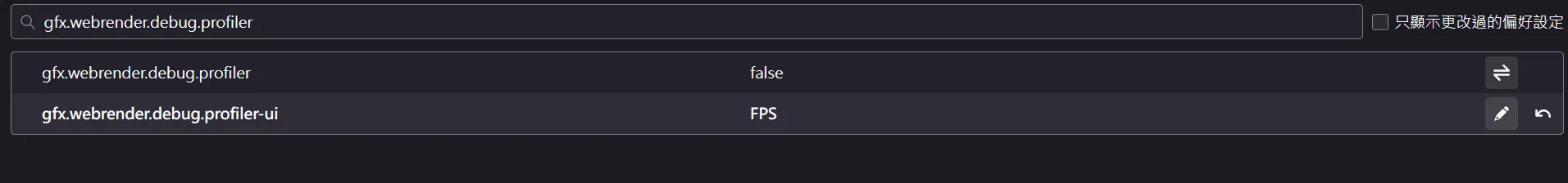
請你搜尋 gfx.webrender.debug.profiler-ui
gfx.webrender.debug.profiler-ui設為FPS,gfx.webrender.debug.profiler-ui設為true(點擊加號)。
記得先設成
FPS再設成true,不然整個畫面會被資訊轟炸,比 Minecraft 的 F3 還要誇張好幾倍。
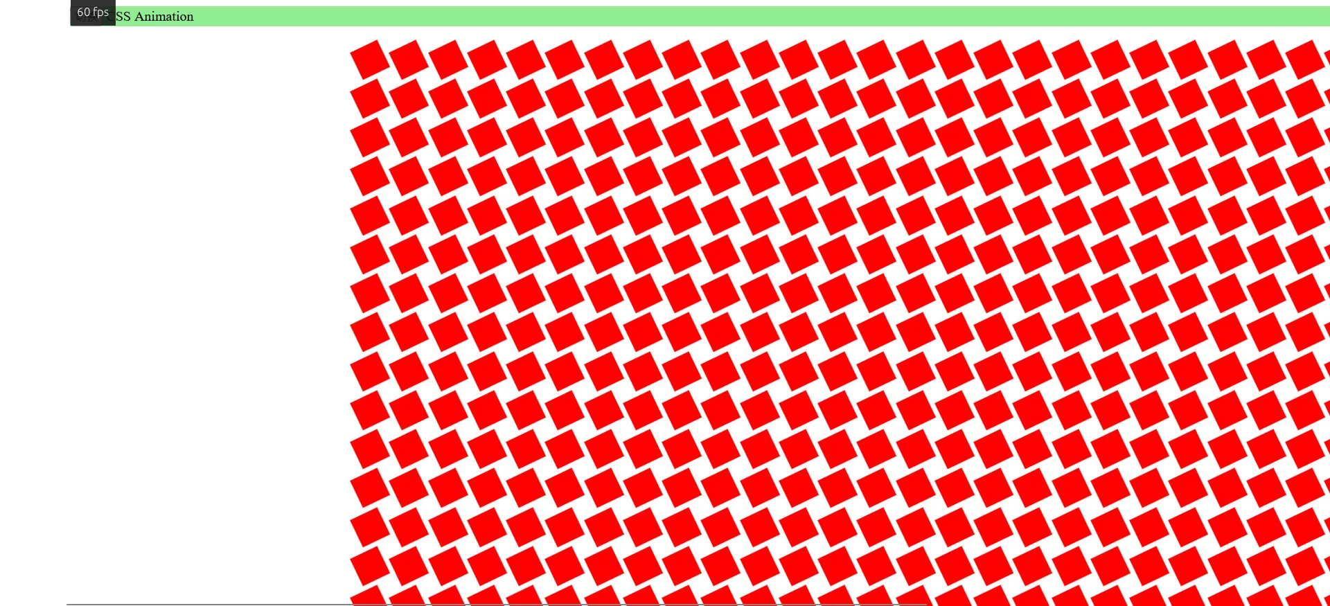
接下來是暖暖包時間,我們要來翻滾 1000 個 <div> 正方形。你可以自行貼上以下程式碼,或是開啟動畫效能比較範例頁。然後點擊切換按鈕來切換動畫方式。
<div id="header"> <button id="toggle-button">切换</button> <span id="type">CSS Animation</span></div><div id="box-container"></div>#header { position: sticky; top: 0.5rem; margin: 0 0.5rem; z-index: 100; background-color: lightgreen;}#box-container { margin-top: 1.5rem; display: grid; grid-template-columns: repeat(40, 1fr); gap: 15px;}.box { width: 30px; height: 30px; background-color: red;}.css-animation { animation: animate 6s linear 0s infinite alternate;}@keyframes animate { 0% { transform: translateX(0) rotate(0deg) scale(0.6); } 100% { transform: translateX(500px) rotate(360deg) scale(1.4); }}const boxes = [];const button = document.getElementById("toggle-button");const boxContainer = document.getElementById("box-container");const animationType = document.getElementById("type");// create boxesfor (let i = 0; i < 1000; i++) { const div = document.createElement("div"); div.classList.add("css-animation"); div.classList.add("box"); boxContainer.appendChild(div); boxes.push(div.style);}let toggleStatus = true;let rafId;button.addEventListener("click", () => { if (toggleStatus) { animationType.textContent = " requestAnimationFrame"; for (const child of boxContainer.children) { child.classList.remove("css-animation"); } rafId = window.requestAnimationFrame(animate); } else { window.cancelAnimationFrame(rafId); animationType.textContent = " CSS animation"; for (const child of boxContainer.children) { child.classList.add("css-animation"); } } toggleStatus = !toggleStatus;});const duration = 6000;const translateX = 500;const rotate = 360;const scale = 1.4 - 0.6;let start;function animate(time) { if (!start) { start = time; rafId = window.requestAnimationFrame(animate); return; } const progress = (time - start) / duration; if (progress < 2) { let x = progress * translateX; let transform; if (progress >= 1) { x = (2 - progress) * translateX; transform = `translateX(${x}px) rotate(${(2 - progress) * rotate}deg) scale(${0.6 + (2 - progress) * scale})`; } else { transform = `translateX(${x}px) rotate(${progress * rotate}deg) scale(${0.6 + progress * scale})`; } for (const box of boxes) { box.transform = transform; } } else { start = null; } rafId = window.requestAnimationFrame(animate);}CSS transition 和 @keyframes
可以看到 FPS 穩定在 60 左右。
JavaScript requestAnimationFrame()
可以看到 FPS 掉到 30 左右。
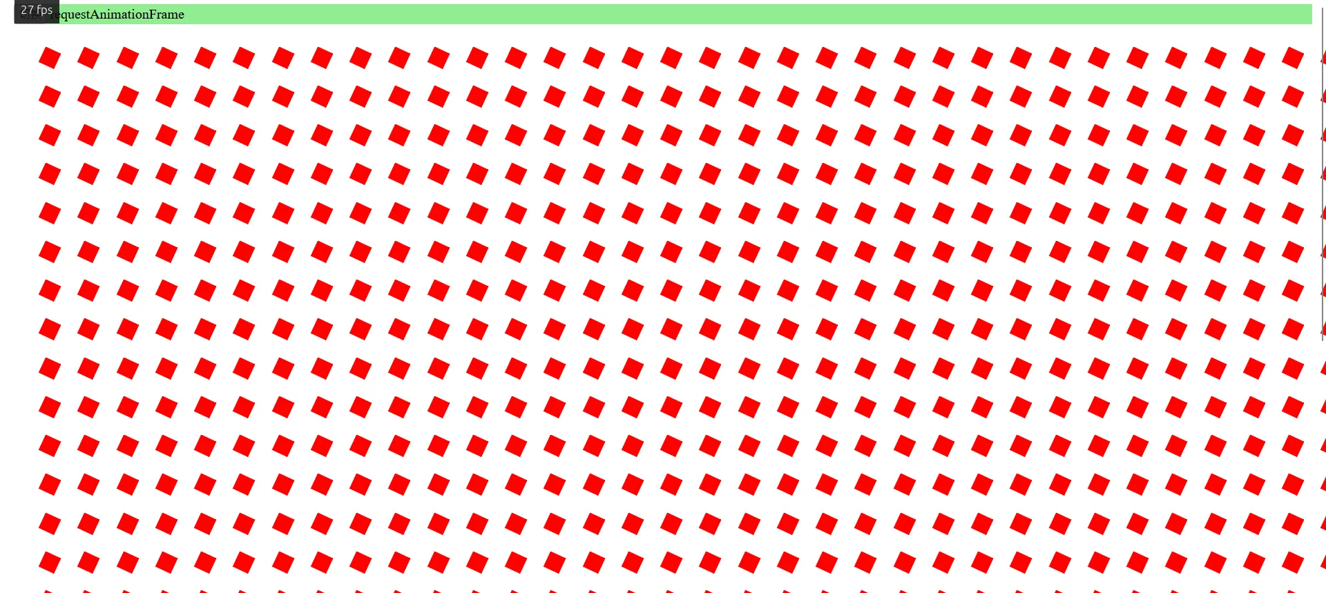
なに?為甚麼?
原因就是使用 CSS 動畫的時候他 Call out 給 GPU 幫忙做硬體加速。而使用 JavaScript 動畫的時候他只能靠 CPU。

JavaScript 的 requestAnimationFrame() 會引起 reflow(重新布局),整個流程需要再跑一次。而 CSS 的 transition 和 @keyframes 只需要單獨稍微調整一下動畫的圖層就好了。
你可以測試一下,關閉硬體加速功能 (不用拔顯卡,到 config 關就可以了) 之後兩者的 FPS 理論上就會差不多了。
JavaScript: 我存在的意義是甚麼?
雖然 CSS3 十分強大,但還是有很多效果是只能透過 JavaScript 實現,或著是使用 JavaScript 實現會更加方便。如果是有複雜的數學邏輯或著是需要互動的動畫,使用 JavaScript 都會比較簡單。
明天我們就來玩玩 JavaScript 的特效吧。
以上就是我今天的分享,歡迎在 Instagram 和 Google 新聞追蹤毛哥EM資訊密技,也歡迎訂閱我新開的YouTube 頻道:網棧。
我是毛哥EM,讓我們明天再見。
留言
留言區